Posts

Showing posts with the label Fruit

ANNAPOORNA INTER FOOD

Image
ANNAPOORNA INTER FOOD The logo of Annapoorna Inter Food (AIF) is a word mark of its name in red and green supported by a pictorial depicting a fruit and vegetable in red and green respectively with two leaves. The colour red is associated with passion, power, strength, courage, determination, energy and celebration and the colour green is associated with agriculture, nature, growth, balance, harmony, environment, prosperity, vitality, prestige, wealth and being very down to earth. The logo is simple, clear and attractive. 

ICAR-NATIONAL INSTITUTE OF SECONDARY AGRICULTURE

Image
ICAR-NATIONAL INSTITUTE OF SECONDARY AGRICULTURE The emblem of ICAR-National Institute of Secondary Agriculture (NISA) has a gear wheel with thick black outline housing the motifs of a pod, trifoliate stem, flower, stem with pollens, and two supporting hands and its name in Devanagari and English with its year of inception. The motifs represent the secondary agricultural produces like gum, resins and aqua produces and the gear wheel represents the processing and converting into usable products for consumption.

ICAR-INDIAN INSTITUTE OF HORTICULTURAL RESEARCH

Image
ICAR-INDIAN INSTITUTE OF HORTICULTURAL RESEARCH The green circular seal of ICAR-Indian Institute of Horticultural Research (IIHR) has the abstract motifs of a fruit, flower, grass and tree placed inside a circle with green outline along with its acronym in Devanagari and English. All the motifs represent the horticultural products or outputs in which the Institutes works on.

MAHARANA PRATAP HORTICULTURAL UNIVERSITY

Image
MAHARANA PRATAP HORTICULTURAL UNIVERSITY The emblem of Maharana Pratap Horticultural University (MPHU) has a green shield housing the motifs of a tree with flowers and fruits supported by an open book, its acronym and the place of the university. The trunk of the tree ends as the nib of a pen. Below the shield, on a banner whose ends bear laurels, the motto of the university in Sanskrit ‘उद्यानेन सम्रुद्दि प्राप्यते’ meaning ‘Wealth Through Horticulture’ is inscribed. These are ensconced in a white border with green outlines, on which its name is inscribed. The shield represents protection, courage, heritage, authority and bravery; the tree, flowers and fruits denote horticulture and cultivation; the open book refers to learning, education, knowledge and wisdom; the laurels denote ceremonies, victory, achievement, hard work and dedication; the nib of a pen refers to the freedom, intelligence, creativity, professionalism, determination and diligence and the colour green symbolise

AGMARK

Image
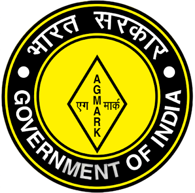
AGMARK To assure that the agricultural products in India conform to a specified set of standards approved by the Directorate of Marketing and Inspection, a certification by the Government of India i.e., AGMARK is used. The present AGMARK standards cover quality guidelines for 205 different commodities spanning a variety of pulses, cereals, essential oils, vegetable oils, fruits, vegetables and semi-processed products such as vermicelli. The term AGMARK was coined by joining the words ‘Ag’ meaning agriculture and ‘mark’ for a certification mark. The logo of AGMARK is a brand mark style consisting of a diamond shaped graphic at the centre that contains the name of the organisation in bilingual form i.e., Hindi and English in yellow and black. ‘एगमार्क’ is written using Devanagari script. The logo is surrounded by ‘Government of India’ typography, which is also bilingual.