Posts

Showing posts with the label Golden

ICAR-INDIAN INSTITUTE OF RICE RESEARCH

Image
ICAR-INDIAN INSTITUTE OF RICE RESEARCH The green, golden yellow and brown emblem of ICAR-Indian Institute of Rice Research (IIRR) has a rice plant with its panicle, leaf and stem and at the right bottom the acronym of the Institute is written in Devanagari and English.

BHARAT PETROLEUM CORPORATION LIMITED

Image
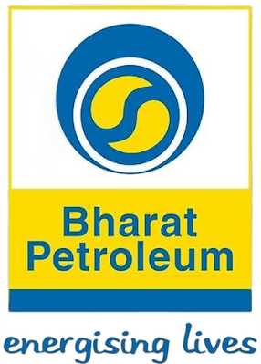
BHARAT PETROLEUM CORPORATION LIMITED Bharat Petroleum is India’s ‘best performing’ Maharatna Public Sector Undertaking and is an oil refining, exploration and marketing conglomerate. In 1928, Asiatic Petroleum (India) joined hands with the Burmah Oil Company, an active producer, refiner and distributor of petroleum products, particularly in Indian and Burmese markets to form the Burmah-Shell Oil Storage and Distributing Company of India Limited. On January 24,1976, as a 100% public sector enterprise, Bharat Refineries Limited, acquired complete ownership of Burmah Shell’s interests in India, including the largest refinery and a nationwide marketing organisation. Bharat Refineries Limited was later named as Bharat Petroleum Corporation Limited. 'Those golden drops of Oil' - this is what is commonly seen as Bharat Petroleum’s logo. However, the genesis of this unique symbol takes one back several centuries to the ancient Chinese civilisation, where a similar

INDIAN INSTITUTE OF MANAGEMENT AMRITSAR

Image
INDIAN INSTITUTE OF MANAGEMENT AMRITSAR Indian Institute of Management (IIM) Amritsar is the fifteenth IIM set up by the Ministry of Education (earlier Ministry of Human Resource Development) with the support of the Government of Punjab. After the registration of IIM Amritsar Society on July 27, 2015, the first batch for the class of 2015-17 was enrolled in August 2015. The Indian Institute of Management Amritsar organised a logo with moto design competition, online through the ‘MyGov’ portal in January 2018 in order to seek people’s involvement and participation in the promotion of IIM Amritsar. A total of 850 entries were received for logo with moto design from different parts of the country. The expert committee shortlisted five entries for the selection of final selection of logo for IIM Amritsar and Board of Governors of IIM Amritsar finalised the logo. The winning logo was designed by Prashant Anant Patil. The logo is inspired by the ‘Flower of Life’ tile design located in

INDIAN INSTITUTE OF TECHNOLOGY PALAKKAD

Image
INDIAN INSTITUTE OF TECHNOLOGY PALAKKAD IIT Palakkad was announced by the Government of India in 2014 and it began in the very next academic year, 2015-16. Its emblem designed by NID is an unique symbol that highlights the notion of synergy and dynamic inter-relationship between research, theory and practice in academics. Inspired from the (5,3) torus knot, the cyclic form rendered in a continuous single line symbolises the process of continuous evolution. The form also has a hidden question mark – representing curiosity. The subtle semblance to the form of a light bulb suggests enlightenment of knowledge, essential to dispel the darkness. The pentamerous elements are symbolic of the ‘pal’ flower. The white star in the centre stands for the illustrious graduates who aspire to make the world a better place. The colour palette is unique with the golden yellow representing the rising sun and its energy and the cool grey representing the propriety of science education.

NO. 17 SQUADRON

Image
NO. 17 SQUADRON The No. 17 Squadron, Air Force also known as 'Golden Arrows', celebrated its 60th anniversary in September 2011. Formed in 1951 at Ambala with Harvard IIB aircraft, the squadron saw action in 1965 and 1971 wars. It also played a key role in 'Op Safed Sagar', the Kargil conflict in 1999 and earned the highest number of gallantry awards in the IAF, including a Vir Chakra.  The crest has a flying arrow from a bow below a flying eagle with the Ashoka on top and the Squadron’s Motto ‘Udayam Ajasram’ meaning 'Infinite Ascent' written below.

AMITY UNIVERSITY

Image
AMITY UNIVERSITY The logo of the AMity University is in the form of a shield divided into dark blue and golden yellow sections by an upward sweeping line that depicts growth and progress in life, achievable through education. While the shield shape represents the resolute shelter of truth, two contrasting yet adjacent colours connote a blend of modernity with tradition. The dark blue with contemporary cues of technology, performance and advancement strikes a synergy with the golden yellow radiance of tradition, culture and values. The flame represents the purity and passion for knowledge, while the upper and lower parts of the flame replicate the arch of 'A' and the bend of 'U' respectively. In a way, this emblem is a good modern adaptation of established elements used for insignia.