Posts

Showing posts with the label Blue Red

NATIONAL INSTITUTE OF HEALTH & FAMILY WELFARE

Image
NATIONAL INSTITUTE OF HEALTH & FAMILY WELFARE The emblem of National Institute of Health & Family Welfare (NIHFW) has a blue lotus with three petals and the area of intersections is white. The white portion holds a red circle. Below the motif its motto in Sanskrit ‘आरोग्यम् सुखसम्पदा’ meaning ‘Health is the Wealth of Happiness’. The lotus refers to  purity, enlightenment, rebirth, transformation, personal growth, resilience, overcoming obstacles and divine beauty and the red circle denotes power, manifestation and vitality.
GUJARAT TECHNOLOGICAL UNIVERSITY

Image
GUJARAT TECHNOLOGICAL UNIVERSITY The red and blue emblem of Gujarat Technological University (GTU) has a shield which denotes the strength of knowledge and education, which houses the motifs of a dam; mortar, pestle and Rx and DNA chain;  a lamp, book, computer and gear wheel; humans with a clock. the domains of engineering the university offers. Below the shield, on a banner its motto in Sanskrit ‘समुचित ज्ञान समन्वय:’ meaning ‘Gathering and Disseminating Knowledge’ is inscribed. Below these, motifs of a globe representing internationalisation; bulb with spark in mind symbolising innovation; a human with multi directional arrows meaning multiple disciplines of the university and the four connecting lines in red denote synchronisation of all the three. The colour red symbolises courage, strength and passion and the colour blue symbolises serenity, intelligence and responsibility.

ICFAI UNIVERSITY RAIPUR

Image
ICFAI UNIVERSITY RAIPUR The emblem of ICFAI University Raipur (ICFAIUR) in Chhattisgarh is a wordmark in red and blue colours. It has its name written in capital serif font in blue colour, supported by a red banner on which ‘University’ is written. Below this ‘Raipur’ is written in black. The colour red represents passion, power, strength, courage, determination, energy and celebration and the colour blue denotes trust, character and integrity.

MAHATMA GANDHI UNIVERSITY OF MEDICAL SCIENCES AND TECHNOLOGY

Image
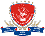
MAHATMA GANDHI UNIVERSITY OF MEDICAL SCIENCES AND TECHNOLOGY The insignia of Mahatma Gandhi University of Medical Sciences and Technology (MGUMST) has a red shield with blue outlines holds the images of Mahatma Gandhi, Staff of Caduceus or Staff of Hermes with a pair of wings and entwined serpents, supported by an open book. These are supported by a pair of laurels and below these its name is written. The shield is supported by a pair of laurels and crested by its acronym ‘MGUMST’. Below the shield, on a blue banner its motto ‘Learning Serving Healing’ is written. The Staff denotes medicine and medical profession; the open book denotes education, knowledge, learning and wisdom; the shield denotes safety, protection, valour, heritage, authority and bravery; the laurels signifies ceremonies, victory, achievement, hard work and dedication; the colour red symbolises passion, power, strength, courage, determination, energy and celebration and the colour blue symbolises serenity, calm

MADAN MOHAN MALAVIYA UNIVERSITY OF TECHNOLOGY

Image
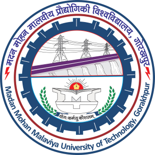
MADAN MOHAN MALAVIYA UNIVERSITY OF TECHNOLOGY The circular insignia of Madan Mohan Malaviya University of Technology (MMMUT) has a blue gear wheel housing the motifs of a electrical transmission lines and tower, a dam on river, a monogram created using its acronym ‘MMMUT’, a nib of a pen on red rising sun, a pair of laurels supporting the monogram and its motto in Sanskrit ‘योगः कर्मसु कौशलम्’ (Verse 50, Chapter 2, Bhagavad Gita) meaning ‘Yoga is Skill in Action’. The gear wheel is ensconced by a white border with red and blue outlines which carries its name in Devanagari and English. The electric lines and tower and dam denotes the fields of engineering; the rising sun denotes life, energy, power, positivity, illumination, light and clarity; the nib of a pen symbolises freedom, intelligence, creativity, professionalism, determination and diligence and the laurels denote ceremonies, victory, achievement, hard work and dedication.  

THE INSTITUTE OF CHARTERED FINANCIAL ANALYSTS OF INDIA UNIVERSITY, SIKKIM

Image
THE INSTITUTE OF CHARTERED FINANCIAL ANALYSTS OF INDIA UNIVERSITY, SIKKIM The insignia of The Institute of Chartered Financial Analysts of India University (ICFAIU), Sikkim has the acronym of its name written in capital serif font in blue colour, supported by a red banner on which ‘University’ is written. Below this ‘Sikkim’ is written in blue and its status is written at the bottom. The colour red represents passion, power, strength, courage, determination, energy and celebration and the colour blue denotes trust, character and integrity.

POWER FINANCE CORPORATION OF INDIA LIMITED

Image
POWER FINANCE CORPORATION OF INDIA LIMITED Incorporated on July 16, 1986, Power Finance Corporation (PFC) Limited is the financial backbone of the Indian power sector and is a leading Non-Banking Financial Corporation in the country. Operating under the administrative control of the Ministry of Power, the organisation was conferred the title of a ‘Navratna CPSE’ in June 2007 and was classified as an Infrastructure Finance Company by the Reserve Bank of India on July 28, 2010. The logo of PFC is a typeface inscribed on a circle with the symbol of electricity placed at the top of typography. The PFC is written in English and पी एफ सी is written in Devanagari script.

POWER GRID CORPORATION OF INDIA LIMITED

Image
POWER GRID CORPORATION OF INDIA LIMITED Founded on October 23, 1989, the Power Grid Corporation of India Limited is an Indian state owned Maharatna company headquartered in Gurugram, India and engaged in transmission of power. Power Grid transmits about 50% of the total power generated in India on its transmission network. The Indian power system for planning and operational purposes is divided into five regional grids. The logo of Power Grid Corporation depicts a symbol of electricity in red colour shade surrounded by grids in blue colour shade. The grids depict the Indian power system for planning and operational purposes.

STAR AIR

Image
STAR AIR Star Air is the aviation arm of prominent Indian business conglomerate Sanjay Ghodawat Group that has its presence in various high value business verticals like agro, aviation, mining, realty, retail, fmcg, energy, education, software and textiles. Star Air offers both scheduled and non-scheduled (charter) flight services at the pan-India level and ensures great comfort and safety to passengers. It started operations in January 2019, offering flights within Karnataka state as well as to neighbouring Andhra Pradesh, Gujarat, Madhya Pradesh, Rajasthan, Uttar Pradesh and Maharashtra as part of the Central Government's UDAN scheme. The red and blue logotype has its name written using bold sans serif type. The interconnected ‘Star’ has a star filling the counter of ‘A’ and the dot on the ‘i’ has a bi-colour star ‘air’. The ‘air’ is depicted like a flying object. Overall the logo looks, legible, vibrant, dynamic and energetic.

U.P. YODDHA

Image
U.P. YODDHA U.P. Yoddha is the kabaddi franchise in the Pro Kabaddi League, the kabaddi team is owned by GMR Group. The team captures the warrior spirit of Uttar Pradesh. The players are known as Yoddha, who are ready to give their blood, sweat and tears in the battlefield. The team made it to the playoffs in every season since its inception in 2017. Its emblem is in the form of a shield in red and blue background crested by the logo of its owner and its name written in extra bold sans serif text supported by the silhouetted image of Arjuna with his bow and arrow targeting a revolving fish by looking at its reflection in the water below.

TVS MOTOR COMPANY

Image
TVS MOTOR COMPANY TVS Motor Company is a reputed two and three-wheeler manufacturer globally, championing progress through sustainable mobility with four state-of-the-art manufacturing facilities in Hosur, Mysuru and Nalagarh in India and Karawang in Indonesia. Rooted in its 100 year legacy of trust, value and passion for customers and exactness, it takes pride in making internationally aspirational products of the highest quality through innovative and sustainable processes. TVS Motor Company endeavours to deliver the most superior customer experience across eighty countries in which we operate. Its logo has its name written in blue colour slab serif bold italics, with the serif of ‘V’ is oriented towards left signifying speed and dynamism. Its leaping horse emblem silhouetted in red colour symbolises speed and vibrancy.