Posts

Showing posts with the label Yellow Ochre

TOURISM DEPARTMENT, GOVERNMENT OF MANIPUR

Image
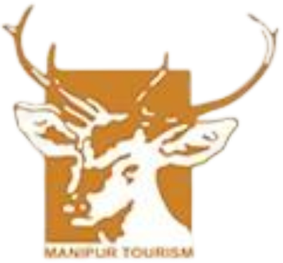
TOURISM DEPARTMENT, GOVERNMENT OF MANIPUR The emblem of Tourism Department, Government of Manipur in yellow ochre colour is a sangai (sə.ŋai) with thots name written at the bottom. The deer with its attractive branching horns offers an interesting representation of the State and the yellow ochre refers to the sandalwood paste which is widely used in the State for different purposes. The colour symbolises eternity, indestructibility and association with God.

PRADHAN MANTRI GARIB KALYAN ANN YOJANA

Image
PRADHAN MANTRI GARIB KALYAN ANN YOJANA The emblem of Pradhan Mantri Garib Kalyan Ann Yojana (PMGKY) in yellow ochre and brown colours has a lotus and an ear of wheat placed in the centre. Below this pictorial the name of the programme is written. The lotus refers to purity, enlightenment, rebirth, transformation, personal growth, resilience, overcoming obstacles and divine beauty; the ear of wheat refers to food, growth and satiation; the colour brown symbolise earthiness, simplicity, stability, humility, warmth, reliability, endurance, timelessness and tradition and the colour yellow ochre symbolises earthiness and wealth.

INDUSIND BANK LIMITED

Image
INDUSIND BANK LIMITED IndusInd Bank is one of India's leading financial services brands. Brand IndusInd Bank is built around its deep focus and strong commitment to the customer and the all-embracing culture of customer-centricity. The bank is inspired by the ethos of the Indus Valley Civilization, one of the oldest civilizations of the world, from which it draws its name and from its rich heritage and legacy. It is from this that it draws on the vibrant symbol of the Zebu Bull. The Zebu is not only a quintessential symbol of the ancient civilization, but it also represents the vibrant and progressive community from which it draws inspiration. The Zebu marks the identity of the brand and its presence seen across all brand touch points. The brand communicates in Burgundy and Yellow Ochre – the brand colours. Exuding warmth and adding vibrancy, these colours help to create a strong and a unique brand identity and visual interest. Their consistent use enables a strong con

INDIAN INSTITUTE OF INFORMATION TECHNOLOGY BHAGALPUR

Image
INDIAN INSTITUTE OF INFORMATION TECHNOLOGY BHAGALPUR Indian Institute of Information Technology, Bhagalpur (IIIT Bhagalpur) is one of the IIITs set up by MHRD, Govt of India in Public Private Partnership (PPP) mode. It started functioning from the academic year 2017. Bhagalpur is known as the silk city, so the letters IIIT are designed to imitate the weaving pattern done in Bhagalpuri Saree. The geometric structure takes inspiration from the main stupa at the centre of Vikrasmshila Mahavidyalaya situated 38 kilometres from Bhagalpur. Technically the profile and shape of the entire logo resembles the NOT gate of a digital circuit resembling the inclination of the institute towards IT. The Red dot symbolises the rising sun. The colour palette is taken from the IIT Guwahati logo as IITG is the mentor for IIIT Bhagalpur. The logo as a whole signifies the rise of the institute. Its motto in Sanskrit is ‘चारित्रयम् मम जीवनम्’ meaning ‘The Three Characters are My Life’.

INDIAN INSTITUTE OF INFORMATION TECHNOLOGY UNA

Image
INDIAN INSTITUTE OF INFORMATION TECHNOLOGY UNA Indian Institute of Information Technology Una (IIIT Una) is one of the twenty IIITs being set up, funded and managed by the Ministry of Human Resource Development, Government of India under the Public Private Partnership (PPP) model. Its emblem has a gear wheel with twelve teeth in yellow ochre, on which its name is written in Devanagari and English. It encircles a motif of WiFi, supported by a book, below which a blue sun, the Himalayan mountains with rivers flowing at the foot are depicted on a brown background. Its motto in Sanskrit ‘विद्या सर्वज्ञ गौरवः’ meaning ‘Knowledge is Omniscient Pride’ is placed at the bottom.