Posts

Showing posts from February, 2024

NATIONAL COOPERATIVE DAIRY FEDERATION OF INDIA LIMITED

Image
NATIONAL COOPERATIVE DAIRY FEDERATION OF INDIA LIMITED  The cyan coloured National Cooperative Dairy Federation of India Limited (NCDFI) is a pictorial of a cattle with its horns forming a drop of milk. The emblem duly depicts a cow and the produce - the milk in a pleasant colour. The colour cyan represents sky, hope, spring, peace, tranquillity, calmness, relaxation and emotional balance.

ANDHRA PRADESH DAIRY DEVELOPMENT COOPERATIVE FEDERATION LTD.

Image
ANDHRA PRADESH DAIRY DEVELOPMENT COOPERATIVE FEDERATION LTD. The emblem of Andhra Pradesh Dairy Development Cooperative Federation Ltd. (APDDCF) has a smiling cow with a cowbell, in the shades of yellow, red and brown, supported by a red slab on which its brand name ‘Vijaya’ is written. Below that its tagline ‘Simply the Best’ is written. This interesting and representative logo depicts energy and dynamism.

BIHAR STATE COOPERATIVE MILK PRODUCERS' FEDERATION LTD.

Image
BIHAR STATE COOPERATIVE MILK PRODUCERS' FEDERATION LTD. The emblem of Bihar State Cooperative Milk Producers' Federation Ltd. (BSMF) in cyan with black outline is a curved thick line with arrow ends, depicting a tree and an all round growth  and movement. Below the motif its brand name COMFED is written. At the bottom its name is written. The colour cyan represents sky, hope, spring, peace, tranquillity, calmness, relaxation and emotional balance.

CHHATTISGARH STATE COOPERATIVE DAIRY FEDERATION LTD.

Image
CHHATTISGARH STATE COOPERATIVE DAIRY FEDERATION LTD. The Chhattisgarh State Cooperative Dairy Federation Ltd. (CSCDF) is a red patch depicting a slashing of milk on which ,देवभोग’ or ‘Devbhog’ is written in Devanagari. Below the red splash in Devanagari ‘दूध एवं दुग्ध पदार्थ’ meaning ‘Milk and Milk Products’ is written. The colour red symbolises passion, power, strength, courage, determination, energy and celebration.

HARYANA DAIRY DEVELOPMENT COOPERATIVE FEDERATION LTD.

Image
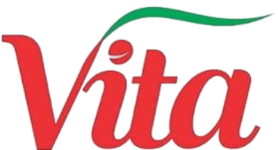
HARYANA DAIRY DEVELOPMENT COOPERATIVE FEDERATION LTD. The emblem of Haryana Dairy Development Cooperative Federation Ltd. (HDDCF) is a red colour word mark of its brand name ‘Vita’ in capital and lowercase with a stroke of ‘V’ is depicted as a green grass denoting the food of the cattles. The colour red denotes passion, power, strength, courage, determination, energy and celebration.

PUDUCHERRY TOURISM DEVELOPMENT CORPORATION

Image
PUDUCHERRY TOURISM DEVELOPMENT CORPORATION The logo of Puducherry Tourism Development Corporation (PTDC) is a word mark created using an experimental typeface to give a casual and effortless look and feel in red colour, with a motif of yellow sun supporting it. The word ‘Peaceful’ crests the logo and its tagline ‘Give Time a Break’ supports from bottom.

JHARKHAND TOURISM DEVELOPMENT CORPORATION LTD.

Image
JHARKHAND TOURISM DEVELOPMENT CORPORATION LTD. The emblem of Jharkhand Tourism Development Corporation Ltd. (JTDC) in golden brown colour is a traditional motif of a lamp with intrinsic designs with its name written alongside to simulate Devanagari script. Below the name its tagline ‘Nature’s Hidden Jewel’ is written. The logo communicates an authentic traditional feel with enchanting, arts, crafts and interesting tourist places. Golden brown is an earthy colour which communicates, style, class and being from the land.

HIMACHAL TOURISM DEVELOPMENT CORPORATION LTD.

Image
HIMACHAL TOURISM DEVELOPMENT CORPORATION LTD. The emblem of Himachal Tourism Development Corporation Ltd. (HTDC) has a black and yellow shield housing the motif of a bow and arrow supporting the monogram of its acronym ‘HT’. The shield is crested by a yellow circle with a black outline holding an upward pointing arrow. This is surmounted by its name ‘Himachal Tourism’. The arrow refers to travel and movement. The emblem is functional and bold.

HARYANA TOURISM CORPORATION LTD.

Image
HARYANA TOURISM CORPORATION LTD. The Haryana Tourism Corporation Ltd. (HTC) emblem in the tones of green, blue and magenta colours has the motif of a pictorial of a peacock along with its name written bold slab serif capitals. Its tagline ‘Come Holiday with Us’ is written below in blue colour. The tones of colours are vibrant and bright and represent its dynamic and exuberant society and land.

GUJARAT TOURISM DEVELOPMENT CORPORATION LTD.

Image
GUJARAT TOURISM DEVELOPMENT CORPORATION LTD. The emblem of Gujarat Tourism Development Corporation Ltd. (GTDC) in orangish tones has the motif of a lion supported by an elaborate textile border design. Its name is written at the bottom of the motif. The pictorial and the colours represent their wildlife, geography and cultural traditions. The colour orange symbolises energy, vitality, creativity, inspiration, joy and happiness and the motif represents leadership, responsibility and pride.

KALEIDEO

Image
KALEIDEO The logo of KaleidEO which deals with high resolution optical mechanisms for satellites and creating satellite fleets is a black word mark of ts name, with the letter ‘A’ depicted as kaleidoscope and ‘O’ written with an over dot. The word mark logo is representative, simple and informative.

AMA ODISHA NAVEEN ODISHA

Image
AMA ODISHA NAVEEN ODISHA The emblem of ଆମ ଓଡିଶା ନବୀନ ଓଡିଶା or Ama Odisha Naveen Odisha meaning ‘Our Odisha New Odisha’ is a green colour conch or ‘shankha’ with three people in bright green, blue and pink colours celebrating. It has its name written on its right top. The conch or shankha is considered sacred in Hinduism as the emblem of Lord Vishnu and Buddhism and it is also known as ‘panchajanya’ and used for spreading the message and for invocation. The people celebrate the arrival of ‘New Odisha’; the colour green denotes agriculture, nature, growth, balance, harmony, environment, prosperity, vitality, prestige, wealth and being very down to earth. And colourful people represent the varied nature of the population.

RAJASTHAN STATE TOURISM DEVELOPMENT CORPORATION LTD.

Image
RAJASTHAN STATE TOURISM DEVELOPMENT CORPORATION LTD. The red, black and white emblem of Rajasthan State Tourism Development Corporation Ltd. (RSTDC) is in the form of a white pennant carrying the pictorial of a silhouette camel with two riders on a red circle with its name written below and crested by its motto in Rajasthani Marwari phrase ‘पधारो म्हारे देस’ meaning ‘Welcome to My Land’. The camel and the sun depicted the State of Rajasthan and its climate. Below the pennant, its tagline ‘Rajasthan The Incredible State of India’ is written.

PUNJAB STATE TOURISM DEVELOPMENT CORPORATION LTD

Image
PUNJAB STATE TOURISM DEVELOPMENT CORPORATION LTD The multicoloured emblem of the Punjab State Tourism Development Corporation Ltd. (PSTDC) is a pictorial of a colourful turban of Sikhs supported by its name in pink and blue written using Gurmukhi style typeface. This is supported by its tagline ‘India Begins Here’. The multiple colours and the turban refers to the dynamism and vibrance of Punjabi culture, history and its places. The pink colour symbolises vibrancy, dynamism and freshness. and the blue symbolises serenity, calmness, trust, spirituality, calmness, wisdom, freedom, openness, intelligence and loyalty.

TOURISM AND CIVIL AVIATION DEPARTMENT, GOVERNMENT OF SIKKIM

Image
TOURISM AND CIVIL AVIATION DEPARTMENT, GOVERNMENT OF SIKKIM The blue emblem of Tourism and Civil Aviation Department, Government of Sikkim (TCAD) is one of the eight auspicious symbols of Buddhism. The eternal knot or endless knot depicts the wisdom and compassion and the journey towards them. In the same manner the travel and tourism are endless and fascinating. The colour blue symbolises serenity, calmness, trust, spirituality, calmness, wisdom, freedom, openness, intelligence and loyalty.

SRM GROUP OF INSTITUTIONS

Image
SRM GROUP OF INSTITUTIONS The emblem of SRM Group of Institutions (SRMGI) in blue and red has a monogram of ‘SRM’ depicted as a pair of folded hands and a mountain with a red dot in the middle and the top portion is separated by a line representing the peak. Below this its name is written in red sans serif bold, supported by a pair of blue lines. The folded hands protect the mountain and the rising sun to reach the peak of the mountain. They also represent humility and sincerity in delivering education. The colours blue symbolises serenity, calmness, trust, spirituality, calmness, wisdom, freedom, openness, intelligence and loyalty and red symbolises passion, power, strength, courage, determination, energy and celebration.   

MISHRA DHATU NIGAM LIMITED

Image
MISHRA DHATU NIGAM LIMITED The blue emblem of Mishra Dhatu Nigam Limited (MDNL) has a pictorial created using ‘M’ forming a star like shape holding the word mark of its Devanagari acronym ‘Midhani’ of the company in its counter. The pictorial represents the minerals and the word mark uses bold sans serif capitals. The colour blue symbolises serenity, calmness, trust, spirituality, calmness, wisdom, freedom, openness, intelligence and loyalty.

LOGIX INDIA

Image
LOGIX INDIA The emblem for Logix India, an annual exhibition on logistics has its name written as a word mark to depict a large transport container in the colours of the containers found all through the world. The colours include denim blue, oxley green, red brown, driftwood yellow and mineral green. The individual letters too are created using the shapes of containers. The serial number of the edition of the exhibition surmounts the word mark and ‘India’ is written at the bottom of the container. it. Its tagline ‘Logistics Multiplier for India’ is inscribed at the bottom.

GALAXEYE SPACE SOLUTIONS PVT LTD

Image
GALAXEYE SPACE SOLUTIONS PVT LTD The word mark black colour logo of Galaxeye Space Solutions Pvt Ltd (GSS) appropriately represents its business of producing multi sensor imaging satellites. It has its name written in sans serif capitals with the letter ‘e’ depicted as earth and the other ‘e’ depicted as a satellite in rotation. Also the ‘e’ and the path of rotation refers to the lens of a camera. The logo is simple, easy to understand, scalable and representative.

AZISTA AEROSPACE

Image
AZISTA AEROSPACE  The emblem of Azista Aerospace (AA) which makes satellite and aerospace systems is a red colour word mark with its name written in capital and lowercase sans serif bold typeface, with the dot on ‘i’ is treated as multi-coloured nine petalled flower referring to the parent company. Below this ‘Aerospose’ and its group’s name Arista Industries Private Limited are written in black. The logo is bold, bright and stands out. The colour red symbolises passion, power, strength, courage, determination, energy and celebration.

INDO-VIETNAMESE CHAMBER OF COMMERCE AND INDUSTRY

Image
INDO-VIETNAMESE CHAMBER OF COMMERCE AND INDUSTRY The emblem of Indo-Vietnamese Chamber of Commerce and Industry (INVCCI) is a word mark of its acronym in blue sans serif typeface with the flags of the respective countries placed inside the counters of the letters ‘C’. The colours orange, green, red and yellow of the flags provide a point of attraction and understanding. Below this the name of the Chamber is written in white. The logo is simple, effective and attractive.

INDIAN BUSINESS CHAMBER IN VIETNAM

Image
INDIAN BUSINESS CHAMBER IN VIETNAM The emblem of Indian Business Chamber In Vietnam (INCHAM) is adapted from the national flags of India - orange, green and blue and Vietnam - red and yellow forming the letter ‘V’. Below the pictorial its acronym is written in blue sans serif capitals and its description is written at the bottom. The logo is innovative, representative and attractive. The colour blue symbolises serenity, calmness, trust, spirituality, calmness, wisdom, freedom, openness, intelligence and loyalty.

US INDIA CHAMBER OF COMMERCE

Image
US INDIA CHAMBER OF COMMERCE The US India Chamber of Commerce (USAIC) has its acronym written in white in blocks of different colours in red, blue, grey, orange and green to represent the multifaceted nature and dynamism of the institution. Below this word mark, its name is written in black and at the bottom its motto ‘Learn Share Network Benefit’ is written in grey. This logo is simple and attractive.

SAPTHAGIRI NPS UNIVERSITY

Image
SAPTHAGIRI NPS UNIVERSITY The blue and gold emblem of Sapthagiri NPS University (SNPSU) has a pictorial of a blue shield with golden sun, mountains, an open book and a portion of an entrance. The name of the university is written in blue and gold sans serif bold capitals. The shield denotes protection, courage, heritage, authority and bravery; the sun denotes life, energy, power, positivity, illumination, light and clarity; the mountains represent constancy, eternity, firmness, and stillness; the open book represents learning, education, knowledge and wisdom; the facade denotes bridge to heaven from earth; the colour blue symbolises serenity, calmness, trust, spirituality, calmness, wisdom, freedom, openness, intelligence and loyalty and the colour gold symbolises wealth, prosperity, power, prestige and achievement.

BITS DESIGN SCHOOL

Image
BITS DESIGN SCHOOL The emblem of BITS Design School (BITDES) has a rectangle with red outline housing the motifs of orange sun, blue horse and flowing water. Below the rectangle, its acronym is written in blue sans serif typeface and its name is written at the bottom. The ‘E’ in the acronym is written with a red and two horizontal bars denoting equality, synonymous and navigation; the sun symbolises life, energy, power, positivity, illumination, light and clarity; water signifies life, motion and fertility; horse symbolises strength, courage and freedom; the colour red denotes passion, power, strength, courage, determination, energy and celebration and the colour blue denotes serenity, calmness, trust, spirituality, calmness, wisdom, freedom, openness, intelligence and loyalty.  

US INDIA BUSINESS COUNCIL

Image
US INDIA BUSINESS COUNCIL The circular blue and red emblem of the US India Business Council (UIBC) has a chakra with a red outline and eight red stars. These are ensconced by a blue circular outline. The wheel and stars represent India and the United States of America. The colours red and blue too represent both the countries.

AMERICAN CHAMBER OF COMMERCE IN INDIA

Image
AMERICAN CHAMBER OF COMMERCE IN INDIA The blue and red American Chamber of Commerce in India (AMCHAM) is an abstract pictorial of blue square holding a red square in its top left corner with its acronym overlapping it at the bottom right and ‘India’ in red at the bottom. The colours red and blue represent the United States of America and India. It is attractive while being representative.

INDO-AMERICAN CHAMBER OF COMMERCE

Image
INDO-AMERICAN CHAMBER OF COMMERCE The logo of Indo-American Chamber of Commerce (IACC) is a word mark with the flags of India and America with orange, blue, green and red colours. The blue colour text is written in capitals and small capitals in serif typeface. The flags cross each other and are placed on the right. The colour blue denotes serenity, calmness, trust, spirituality, calmness, wisdom, freedom, openness, intelligence and loyalty.

INDIA THAI CHAMBER OF COMMERCE

Image
INDIA THAI CHAMBER OF COMMERCE The blue colour emblem of India Thai Chamber of Commerce (ITCC) is in the form of a seal with the monogram of its acronym depicted in conventional manner and ensconced by a border by a ten petalled flower spread, which carries the name of the Chamber in Thai and English. The flower represents both the countries and the colour blue denotes serenity, calmness, trust, spirituality, calmness, wisdom, freedom, openness, intelligence and loyalty.

INDO SPANISH CHAMBER OF COMMERCE

Image
INDO SPANISH CHAMBER OF COMMERCE The emblem of the Indo Spanish Chamber of Commerce (ISCC) has a pictorial of a circle with thick border which is coloured in the colours from the respective countries’ national flags in red, yellow, green, white and orange with black outlines. On the right the name of the Chamber is written. The circle denotes totality, wholeness, original perfection, the Self, the infinite, eternity, timelessness, all cyclic movement and God.

SINGAPORE INDIAN CHAMBER OF COMMERCE AND INDUSTRY

Image
SINGAPORE INDIAN CHAMBER OF COMMERCE AND INDUSTRY The circular emblem of Singapore Indian Chamber of Commerce and Industry (SICCI) is a blue globe with longitudinal and latitudinal lines with a pair of thick red arrows facing each other placed on it. The globe refers to the nature and scope of commerce and trade and the red arrows refers to the reach and access and the willingness to go dynamically. Below the pictorial, its name and years of establishment of the Chamber are written.

INDIA SWEDEN JOINT BUSINESS COUNCIL

Image
INDIA SWEDEN JOINT BUSINESS COUNCIL The circular emblem of India Sweden Joint Business Council (ISJBC) houses the portions of national flags of Sweden and India in blue, yellow, orange and green with crown and Ashoka Chakra. These are ensconced by a circular border with black outlines, on which its name is inscribed. The seal or emblem is a classic and colourful representation of an identity.

TOURISM DEPARTMENT, GOVERNMENT OF MANIPUR

Image
TOURISM DEPARTMENT, GOVERNMENT OF MANIPUR The emblem of Tourism Department, Government of Manipur in yellow ochre colour is a sangai (sə.ŋai) with thots name written at the bottom. The deer with its attractive branching horns offers an interesting representation of the State and the yellow ochre refers to the sandalwood paste which is widely used in the State for different purposes. The colour symbolises eternity, indestructibility and association with God.

TRIPURA TOURISM

Image
TRIPURA TOURISM The emblem of Tripura Tourism (TT) has multiple motifs representing the State of Tripura forming a shape of the map of Tripura. This is supported by its name written at the right bottom with ‘Tripura ‘ written in sans serif bold with multiple colours denoting the varied and extensive culture and traditions of the State. The motifs in the map include rivers, mountains, forests, mask for dance, temple facade, pineapple, rising sun, sugarcane, local woman, splashing of colours and a monkey. The emblem is attractive and communicates the places of interests effortlessly and it is dynamic.

UTTAR PRADESH STATE TOURISM DEVELOPMENT CORPORATION LTD.

Image
UTTAR PRADESH STATE TOURISM DEVELOPMENT CORPORATION LTD. The red colour emblem of Uttar Pradesh State Tourism Development Corporation Ltd. (UPSTDC) is a monogram of ‘UPT’ drawn like a pair of roads as a connecting line which is supported by its acronym and its name. The monogram refers to the roads and the paths of tourism. The colour red denotes passion, power, strength, courage, determination, energy and celebration.

SAARC CHAMBER OF COMMERCE AND INDUSTRY

Image
SAARC CHAMBER OF COMMERCE AND INDUSTRY The blue toned insignia of SAARC Chamber of Commerce and Industry (SCCI) has a heptagonal shape holding a heptagonal star housing the emblem of SAARC in gold colour and surrounded by its name. The star symbolises gear, industry and enterprise and the heptagon symbolises the seven member countries. The colour blue denotes serenity, calmness, trust, spirituality, calmness, wisdom, freedom, openness, intelligence and loyalty.