Posts

Showing posts with the label Burgundy

INDUSIND BANK LIMITED

Image
INDUSIND BANK LIMITED IndusInd Bank is one of India's leading financial services brands. Brand IndusInd Bank is built around its deep focus and strong commitment to the customer and the all-embracing culture of customer-centricity. The bank is inspired by the ethos of the Indus Valley Civilization, one of the oldest civilizations of the world, from which it draws its name and from its rich heritage and legacy. It is from this that it draws on the vibrant symbol of the Zebu Bull. The Zebu is not only a quintessential symbol of the ancient civilization, but it also represents the vibrant and progressive community from which it draws inspiration. The Zebu marks the identity of the brand and its presence seen across all brand touch points. The brand communicates in Burgundy and Yellow Ochre – the brand colours. Exuding warmth and adding vibrancy, these colours help to create a strong and a unique brand identity and visual interest. Their consistent use enables a strong con

AXIS BANK LIMITED

Image
AXIS BANK LIMITED Axis Bank is the third largest private sector bank in India. The bank offers the entire spectrum of financial services to customer segments covering large and mid-corporates, MSME, agriculture and retail businesses. The bank was promoted in 1993, jointly by Specified Undertaking of Unit Trust of India (formerly known as Unit Trust of India), Life Insurance Corporation of India, General Insurance Corporation of India, National Insurance Company Ltd., The New India Assurance Company Ltd., The Oriental Insurance Company Ltd. and United India Insurance Company Ltd.. The logo of the bank was designed by Ogilvy & Mather and is the brainchild of Sumanto Chattopadhyay. The logo design of Axis Bank is based on the letter ‘A’. It is a contemporary, universal and solid design that retains the burgundy colour of the original UTI logo as a link to its heritage. The logo has two strokes, the first stroke depicts forward growth while the second stroke sign

INDIAN INSTITUTE OF MANAGEMENT RAIPUR

Image
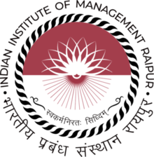
INDIAN INSTITUTE OF MANAGEMENT RAIPUR Indian Institute of Management (IIM) was set up by the Government of India, Ministry of Human Resource Development in 2010 at Raipur, the capital of Chhattisgarh. The aureole of IIM Raipur’s logo depicts the traditional Bastar Dhokra art (Sun handicraft made out of metal) of tribal Chhattisgarh that involves precision, practice and skill. Being a State of adivasis, the sun is also considered to be sacred and supreme by them. The colours used in the entire design are burgundy and black. While the burgundy stands for boldness, creativity and wisdom; black signifies balance. The typeface used here is Montserrat indicating uniqueness, simplicity and leadership. The flower-like motif signifies symmetric and balanced growth, nurturing and prosperity of the institute. The motif in the bottom half of the circle signifies the roots from which the growth of the institute comes from its global outlook embedded with regional and national