Posts

Showing posts with the label Brown

YOGAATHMA FOUNDATION

Image
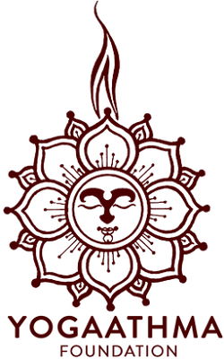
YOGAATHMA FOUNDATION The brown colour emblem of Yogaathma Foundation is a 16 petal lotus spread housing a smiling face in the centre crested by a flame and supported by its name. The lotus refers to purity, enlightenment, rebirth, transformation, personal growth, resilience, overcoming obstacles and divine beauty; the flame refers to enlightenment, hope, life, truth and the regenerative power; the smiling face denotes contentment and peace and the colour brown symbolises earthiness, simplicity, stability, humility, warmth, reliability, endurance, timelessness and tradition. 

SOHAM AYUR YOGA ASHRAM

Image
SOHAM AYUR YOGA ASHRAM The brown colour emblem of Soham Ayur Yoga Ashram is an abstract motif of a swan forming a circle supported by its name in crisp sans serif typeface. The swan refers to flexibility, aesthetics and innate strength and the colour brown symbolises earthiness, simplicity, stability, humility, warmth, reliability, endurance, timelessness and tradition.

NATH YOGA ASHRAM

Image
NATH YOGA ASHRAM The emblem of Nath Yoga Ashram is in the tones of brown with a silhouetted image of Lord Shiva  with three faces supported by a thin yellow line and its name written in thin stylised capitals. The three faces of Lord Shiva denote creation, protection and destruction and the colour brown denotes earthiness, simplicity, stability, humility, warmth, reliability, endurance, timelessness and tradition.

RED EARTH GOKARNA

Image
RED EARTH GOKARNA The emblem of Red Earth Gokarna has a pictorial of an old tree with shade, supported by its name in browns and dark brown coloured experimental typeface  and sans serif type in two lines. The logo appears to be earthy and grounded by its colours and rustic presentation. The solo tree refers to strength, individuality, expression, calmness, growth, the interconnectedness of everything and perpetuity.

NIC ICE CREAMS

Image
NIC ICE CREAMS The logo of Nic Ice Creams is a light brown circle with dark brown details. Its name is written in lowercase using sans serif letters. Its tagline 'Honestly Crafted Ice Creams' and a motif of a flower with two leaves are placed below. All these are ensconced by a circle with two dots. The logo resembles a top view of an ice cream cup with an image on it.

HATHA VIDYA GURUKULAM

Image
HATHA VIDYA GURUKULAM The circular seal of Hatha Vidya Gurukulam (HVG) has a circle with sun housing a crescent moon holding an image of a sage practising yoga. These are ensconced by a circle with a brown outline. It is placed within a circular border with a brown outline. The border carries the name of the ashram and the name of its yoga tradition. The sun represents life, energy, power, positivity, illumination, light and clarity; the crescent moon represents life and death and the sage represents tradition and age. The emblem gives a feel of ancient and traditional at the same time. 

ACHINTYA AYURYOGA

Image
ACHINTYA AYURYOGA The yellow, green and brown emblem of Achintya Ayuryoga has a pictorial and a word mark. The pictorial takes the shape of Lord Ganesha and that of a lotus with a leaf growing out. Its name surmounts the motif in brown and green colours. Lord Ganesha refers to wisdom, prosperity, beginnings and removal of obstacles; the lotus refers to purity, enlightenment, rebirth, transformation, personal growth, resilience, overcoming obstacles and divine beauty and the green leaf refers to hope, renewal and revival.

AATM YOGASHALA

Image
AATM YOGASHALA The insignia of Aatm Yogashala is the motif of a person in yoga posture and a wordmark of its name in two lines supported by its motto in Sanskrit ‘सर्वे सन्तु निरामयाः’ (1.4.14, Brihadaranyaka Upanishad ) meaning ‘May All be Healthy’ in black. The brown colour symbolises earthiness, simplicity, stability, humility, warmth, reliability, endurance, timelessness and tradition.

INDIAN NURSING COUNCIL

Image
INDIAN NURSING COUNCIL The yellow and brown circular insignia of Indian Nursing Council (INC) has an open book supporting a traditional lamp lighting the dark half of the circle. It is surmounted by its name in Devanagari and supported by its name in English. The book refers to knowledge, education, wisdom and learning and the lamp refers to light, illumination, awakening, devotion, purity, guidance, protection, hope and prosperity.

RAJCOMP INFO SERVICES LIMITED

Image
RAJCOMP INFO SERVICES LIMITED The emblem of RajCOMP Info Services Limited (RISL) has an abstract pictorial of tricolour - light brown, purple and cyan patchy swirls supported by its acronym RISL. The logo is interesting, calls for attention and sober.  

CHENNAI PORT AUTHORITY

Image
CHENNAI PORT AUTHORITY  The emblem of Chennai Port Authority (CPA) has a brown anchor placed in a blue circle. This is ensconced by a border with a blue outline on which its name is written. The border is circumscribed by a rope, which is commonly used in ships. The colour brown symbolises earthiness, simplicity, stability, humility, warmth, reliability, endurance, timelessness and tradition and the colour blue denotes water and symbolises serenity, calmness, trust, spirituality, calmness, wisdom, freedom, openness, intelligence and loyalty.

KERALA MARITIME BOARD

Image
KERALA MARITIME BOARD The emblem of Kerala Maritime Board (KMB) has a red helm or sailor’s wheel ensconced by a sailor’s rope in blue colour housing a brown circle which bears its name in English and Malayalam. Inside the circle are the motifs of a ship, a map of the State of Kerala, an anchor and its acronym KMB. The whole pictorial sails on waves of water. The emblem is interesting, attractive and detailed.

AJMER VIDYUT VITRAN NIGAM LIMITED

Image
AJMER VIDYUT VITRAN NIGAM LIMITED The circular emblem of Ajmer Vidyut Vitran Nigam Limited (AVVNL) has a reddish brown motif of a pair of hands protecting an electric bulb placed inside an orange circle, which is ensconced by a yellow ochre border on which its name is written along with five dots. The logo is prominent and representative.

POPULATION RESEARCH CENTRE

Image
POPULATION RESEARCH CENTRE The emblem of Population Research Centre (PRC) has a pictorial of a typical statistical chart of population ratio ensconced by a square revolving in multiple colours from greenish blue to fresh green referring to evolving and varied population. The motifs are circumscribed by its name and ensconced further by a pair of thin and thick circular borders. All of these are supported by a brown banner on which its name is written in Devanagari and at the bottom its motto in Sanskrit ‘लोकाः समस्ताः सुखिनो भवन्तु’ meaning ‘May All the World be Happy’. The colour brown denotes earthiness, simplicity, stability, humility, warmth, reliability, endurance, timelessness and tradition.

LIDKAR

Image
LIDKAR Lidkar is the brand name of a range of leather products from Dr Babu Jagjivan Ram Leather Industries Development Corporation Ltd. (BJRLIDC). THe emblem of Lidkar is a pictorial created juxtaposing the motifs of cobbler’s anvil and also use of the letter ‘L’. This pictorial is supported by its name ‘Lidkar’ written below in serif typeface. Its tagline ‘Made for Life’ is written at the bottom. The colour brown symbolises earthiness, simplicity, stability, humility, warmth, reliability, endurance, timelessness and tradition. The logo is interesting and representative.

DR BABU JAGJIVAN RAM LEATHER INDUSTRIES DEVELOPMENT CORPORATION LTD.

Image
DR BABU JAGJIVAN RAM LEATHER INDUSTRIES DEVELOPMENT CORPORATION LTD. The emblem of Dr Babu Jagjivan Ram Leather Industries Development Corporation Ltd. (BJRLIDC) is a hide which houses a motif artisan or cobbler working and its brand name Lidkar and supported by a gear wheel. The hide  and the artisan represent the leather industry; the gear wheel denotes interconnectedness, efficiency, precision, progress, advancement, synchronisation, timing, order and structure and the colour brown symbolises earthiness, simplicity, stability, humility, warmth, reliability, endurance, timelessness and tradition. The logo is interesting and representative.

BIHAR STATE TOURISM DEVELOPMENT CORPORATION

Image
BIHAR STATE TOURISM DEVELOPMENT CORPORATION The Bihar State Tourism Development Corporation (BSTDC) has the lion motif on a pillar of Sarnath of Ashoka period placed above the map of Bihar as its emblem. This pictorial conveys the historical significance and cultural heritage of the State in gold and brown tones. The acronym of its name is written below the pictorial. The emblem is impressive and meaningful.

ATOMIC ENERGY EDUCATION SOCIETY

Image
ATOMIC ENERGY EDUCATION SOCIETY The emblem of Atomic Energy Education Society (AECS) is an ellipse in portrait housing the motifs of a traditional lamp and an atomic structure. This is ensconced by the letter 'C' which forms a border bearing its name and motto. The motto in Sanskrit ‘तत् त्वं पूषण अपावृणु’ (Mantra 15, Isha Upanishad) meaning ‘He Surya, Remove this Veil over Knowledge’. The traditional lamp refers to light, illumination, awakening, devotion, purity, guidance, protection, hope and prosperity; the atomic symbol refers to its management; the colour brown denotes earthiness, simplicity, stability, humility, warmth, reliability, endurance, timelessness and tradition and the letter 'C' refers to 'Central'.

MADHYA PRADESH STATE COOPERATIVE DAIRY FEDERATION LTD. SANCHI

Image
MADHYA PRADESH STATE COOPERATIVE DAIRY FEDERATION LTD. SANCHI The logo of Madhya Pradesh State Cooperative Dairy Federation Ltd. (MPSCDF) has a pictorial of a cow with a child supporting its brand name ‘Sanchi’ and ‘साँची’ in cyan and blue placed in a cyan circle. At the bottom of the logo its motto in Devanagari ‘शुद्धता का संकल्प’ meaning ‘Pledge for Purity’ is written. The colours blue symbolises serenity, calmness, trust, spirituality, calmness, wisdom, freedom, openness, intelligence and loyalty and cyan symbolises sky, hope and spring, peace, tranquillity, calmness, relaxation and emotional balance. The logo is demonstrative, interesting and attractive.

KERALA COOPERATIVE MILK MARKETING FEDERATION LTD.

Image
KERALA COOPERATIVE MILK MARKETING FEDERATION LTD. The brown colour emblem of Kerala Cooperative Milk Marketing Federation Ltd. (KCMMF) has a pictorial of a motif of the face of a cattle placed in a brown circle supported by its brand name ‘Milma’ written in lowercase Souvenir extra bold typeface. The logo is prominent, legible and bold. The brown colour represents earthiness, simplicity, stability, humility, warmth, reliability, endurance, timelessness and tradition.