Posts

Showing posts with the label Food

NARENDRA DEO UNIVERSITY OF AGRICULTURE AND TECHNOLOGY
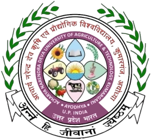
Image
NARENDRA DEO UNIVERSITY OF AGRICULTURE AND TECHNOLOGY The insignia of Narendra Deo University of Agriculture and Technology (NDUAT) is a circular seal supported by a banner at the bottom and a pair of laurels on sides. A purple colour circular border on which the name of the university is inscribed, houses the motifs of an open book symbolising learning, education, knowledge and wisdom; rising sun symbolising life, energy, power, positivity, illumination, light and clarity; the laurels denote ceremonies, victory, achievement, hard work and dedication and a pair of wheat crests, a sunflower, a microscope, a tractor, a milk cow, fruits and vegetables symbolising agriculture and technology. The place of the university is written in English and Devanagari on a panel below the border. The name in Devanagari circumscribes the circular border. The banner at the bottom is inscribed with its motto in Sanskrit ‘अन्नम् हि जीवानां ज्येष्टम्’ meaning ‘Food is Life for the Living Beings’.

FORTUNE EDIBLE OILS AND FOODS

Image
FORTUNE EDIBLE OILS AND FOODS Incorporated in 1999, Adani Wilmar is a food processing company and a joint venture between Adani Enterprises and Wilmar International. In November 2000, Adani Wilmar launched its flagship brand ‘Fortune’ under which it produces and sells edible oils including sunflower oil, palm oil, soybean oil, mustard oil, rice bran oil, cottonseed oil, groundnut oil and vanaspati. The visual identity of the company is to convey the transformation in its structure to its customers. The new identity stives to drive three major principles - vibrancy, which represents freshness, modernity and energy; abundance, which stands for authentic taste and flavour and diversity, which reflects its food offerings beyond oils. These are encapsulated in a visual device - the Bloom. The ‘o’ in the word Fortune, has been changed for the ‘Bloom’ device, with each leaf symbolizing the multiple categories it operates in. The design was developed by a London-based agen

AYURVEDA AAHAR

Image
AYURVEDA AAHAR Draft for Food Safety and Standards (Ayurveda Aahar) Regulations, 2021 was notified on June 30, 2021. Ayurveda Aahar means a food prepared in accordance with the recipes or ingredients and/or processes as per methods described in the authoritative books of Ayurveda listed under ‘Schedule A’ of the regulations. It also includes products which have other botanical ingredients in accordance with the concept of Ayurvedic Aahar but does not include Ayurvedic drugs or proprietary Ayurvedic medicines and medicinal products, cosmetics, narcotic or psychotropic substances, herbs listed under Schedule E of Drug and Cosmetic Act, 1940 and Rules 1945 thereunder, metals based Ayurvedic drugs or medicines, bhasma or pishti and any other ingredients notified by the Authority (FSSAI) from time to time. The proposed label is predominantly blackish green has a monogram created using Devanagari ‘अ’ and ‘A’ together topped with five leaves in different shades in a l

VEGETARIAN AND NON-VEGETARIAN FOOD

Image
VEGETARIAN AND NON-VEGETARIAN FOOD “As per FSS (Packaging and Labelling) Regulations, 2011, a ‘non-vegetarian food’ means an article of food which contains whole or part of any animal including birds, fresh water or marine animals or eggs or products of any animal origin, but excluding milk or milk products, as an ingredient and ‘Vegetarian Food’ means any article of food other than non-vegetarian food. It is mandatory for all food manufacturers to indicate as to whether the food item contains any non-vegetarian ingredients or not. To enable the consumer to know whether any packaged food is vegetarian or non-vegetarian, this will be indicated in the form of a brown triangle in square or green circle in a square on the package. A brown triangle is to indicate the presence of nonvegetarian ingredients in the food item, while a green circle indicates that the food item is vegetarian. The green circle and brown triangle in a square are indicated as vegetarian and non-ve

JAIVIK BHARAT (ORGANIC FOODS)

Image
  JAIVIK BHARAT (ORGANIC FOODS) “Organic foods are products of holistic agricultural practices focusing on biodiversity, soil health, chemical free inputs etc., and produced in accordance with Organic Production Standards as per the FSS (Organic Foods) Regulations, 2017. The Jaivik Bharat logo for organic food is an identity mark to distinguish organic products from non-organic ones. The unified logo is an identity mark to distinguish organic products from non-organic ones supported with the tagline ‘Jaivik Bharat’ at the bottom, which signifies Organic Food from India. Effectively intertwining all the elements of environment, the logo communicates adherence to the National Organic Standards. The logo is supported with the tagline ‘Jaivik Bharat’, at the bottom, which signifies organic food from India. Employing a simple approach to communicate an effective message, the green color of the logo symbolizes nature along with articulating that these foods are produced in

FOOD FORTIFICATION (F+ LOGO)

Image
FOOD FORTIFICATION (F+ LOGO) “Fortification is the addition of key vitamins and minerals such as Iron, Iodine, Zinc, Vitamins A and D to staple foods such as rice, wheat, oil, milk and salt to improve their nutritional content. These nutrients may or may not have been originally present in the food before processing or may have been lost during processing. Deficiency of micronutrients or micronutrient malnutrition is a serious health risk. Access to safe and nutritious food is a must and sometimes due to lack of consumption of a balanced diet, lack variety in the diet or unavailability of food, one does not get adequate micronutrients. Often, there is considerable loss of nutrients during the processing of food as well. One of the strategies to address this problem is fortification of food. This method complements other ways to improve nutrition such as diversification of diet and supplementation of food. The food fortification logo is an identity mark to distinguish

'RADURA' LOGO (IRRADIATION OF FOOD)

Image
RADURA LOGO (IRRADIATAION OF FOOD) Food irradiation is a physical process in which food commodities, bulk or pre-packaged are exposed to controlled doses of energy of ionizing radiation such as gamma rays or X-rays to achieve different technological objectives. This technological process includes extension of shelf-life, destruction of storage and quarantine insect pests and killing of parasites, pathogens and spoilage microorganisms. Radiation processing can thus be used for enhancing food safety, food security and international trade. It became mandatory in 2007 to treat Indian mangoes with gamma radiation for control of quarantine insect pests before export to the USA. In India more than a dozen irradiation facilities have been established by private entrepreneurs for treatment of food. For commercial application of the technology in India, Atomic Energy (Control of Irradiation of Food) Rules were notified in 1991 and later amended in 1996. In 2012, a new amendmen

FOOD CORPORATION OF INDIA

Image
FOOD CORPORATION OF INDIA The Food Corporation of India (FCI) was setup under the Food Corporation Act 1964 , in order to fulfill following objectives of the Food Policy of ensuring effective price support operations for safeguarding the interests of the farmers, distribution of foodgrains throughout the country for public distribution system and maintaining satisfactory level of operational and buffer stocks of foodgrains to ensure national food security. Since its inception, FCI has played a significant role in India's success in transforming the crisis management oriented food security into a stable security system. Its green coloured logo has three stems of ripe cereals. Above this the name of the organisation is written in Devanagari and in the bottom white banner, its name in English is written. https://fci.gov.in/aboutUs.php https://en.wikipedia.org/wiki/Food_Corporation_of_India http://fciweb.nic.in/# https://www.scribd.com/doc/298953769/Swamy-s-Symbols-of-India-Volum

FOOD SAFETY AND STANDARDS AUTHORITY OF INDIA

Image
FOOD SAFETY AND STANDARDS AUTHORITY OF INDIA The Food Safety and Standards Authority of India (FSSAI) has been established under Food Safety and Standards Act, 2006 which consolidates various acts & orders that have hitherto handled food related issues in various Ministries and Departments. FSSAI has been created for laying down science based standards for articles of food and to regulate their manufacture, storage, distribution, sale and import to ensure availability of safe and wholesome food for human consumption. Its five coloured logo has its acronym in italics in dark blue and the horizontal stroke of ‘f’ extended in orange to form the top border with a dot for ‘i’ in brown dot symbolising a fruit and a green leaf. The letter ‘i’ which is bold in orange symbolises freshness. The logo is underlined in green colour. https://www.fssai.gov.in/cms/compliancefaq.php http://www.fssai.gov.in/AboutFssai/Introduction.aspx?RequestID=mkmtU1mSH4UM0ths8u1_doAction=True https://www.sc

AGRICULTURAL AND PROCESSED FOOD PRODUCTS EXPORT DEVELOPMENT AUTHORITY

Image
AGRICULTURAL AND PROCESSED FOOD PRODUCTS EXPORT DEVELOPMENT AUTHORITY Agricultural And Processed Food Products Export Development Authority (APEDA) was established in 1986 as a Statutory Body under an Act of Parliament. The Authority, with its headquarters at New Delhi, is headed by a chairman. The Authority has five regional offices at Guwahati, Hyderabad, Kolkata, Bangalore and Mumbai and is entrusted with the task of promoting agricultural exports, including the export of processed foods in value added form. During the year 2009-10, APEDA has been empowered by an Act of Parliament to enforce the Intellectual Property Right of Geographical Indications for Basmati Rice. Its green colour logo has and abstract depiction of agricultural products supported on its right side by the Devanagari and English acronym of the organaisation.

NATIONAL INSTITUTE OF FOOD TECHNOLOGY ENTREPRENEURSHIP AND MANAGEMENT

Image
NATIONAL INSTITUTE OF FOOD TECHNOLOGY ENTREPRENEURSHIP AND MANAGEMENT The emblem of National Institute of Food Technology Entrepreneurship and Management (NIFTEM) has an eight petalled flower holding the motifs of an open book, a microscope, a factory and a mortarboard hat representing food technology and food processing. It is supported by a pair of wheat crests on sides; by its tagline अन्नं न परिचक्षीत तद् व्रतम् at the bottom and surmounted by its name. All these are ensconced by a gear wheel which forms the border on which its name is inscribed in Devanagari. Below the gear wheel on a banner, its motto in Sanskrit 'ज्ञान - नवोन्मेष - विस्तार' meaning 'Knowledge - Innovation - Outreach' is written. Its acronym is written below the banner.