Posts

Showing posts from March, 2023

CONROY INTERNATIONAL SCHOOL

Image
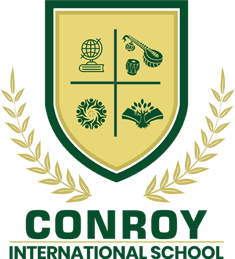
CONROY INTERNATIONAL SCHOOL The Conroy International School will be distinguished by its unique approach and values towards learning and its commitment to provide quality education. The school emblem has a shield having four motifs and a pair of laurels. The shield represents strength, solidarity, a guarded environment and safety. The laurel leaves are a symbol of eternal glory, of special achievement, success, triumph and hence the pinnacle that the students will experience after getting educated from our school. The logo amalgamates features of global outlook, innovation, experimentation, strong foundation, knowledge, excellence and holistic development of mind projecting our ethos and orientation of imparting knowledge to our students that will converge to facilitate students attaining the pinnacle of success. The colours green, yellow and gold represent a set of qualities. Green is associated with growth, health, renewal, harmony and freshness. On the other hand, it c

NATIONAL HIGHWAY LOGISTICS MANAGEMENT LIMITED

Image
NATIONAL HIGHWAY LOGISTICS MANAGEMENT LIMITED National Highways Logistics Management Limited (NHLML), an SPV of NHAI, (Formerly known as Cochin Port Road Company Limited) formed under the guidance of the MoRT&H for the implementation of multi-modal logistic parks (MMLPs), port connectivity roads, wayside amenities, value capture financing and other associated projects. NHLML will be responsible for end-to-end development of multimodal logistic parks, port connectivity, entrusted by NHAI from time to time, right from DPR preparation, land acquisition, project execution and O&M. Its cyan, grey and blue circular emblem has a ship and train in the horizon facilitated by roads and ways and in its bottom right its acronym NHLML is written.

WILLOWOOD CHEMICAL PVT LIMITED

Image
WILLOWOOD CHEMICAL PVT LIMITED  Willowood Chemical Pvt Limited has been based in India since 2006 and has worked alongside agrochemical formulators, distributors and farmers to provide a wide range of top quality crop protection products. Its red, green blue logo has a monogram with letters ‘W’ and ‘L’ placed adjacent to a twig of leaves within a curved cornered rectangle and a wordmark of its name using a crisp sans serif font.

TROPICAL AGROSYSTEM INDIA (P) LTD.

Image
TROPICAL AGROSYSTEM INDIA (P) LTD. Tropical Agrosystem India (P) Ltd., is one of the lead players in the Indian crop and pest management industry. The company belongs to the well-known Jhaver Group- for whom every business vision is a business reality. The company is fully poised for ushering in the new age in seeds, crop nutrition protection and pest management in India. Its green, yellow and black logo has a motif of a scarecrow, below which its name is written. In between ‘Tropical’ and ‘Agro’ a sun is placed. The motif and colours are representing the industry in which it is operating and the is easily identifiable with its products and their purpose.

TAGROS CHEMICALS INDIA PVT. LTD.

Image
TAGROS CHEMICALS INDIA PVT. LTD. Established in 1992, Tagros is a flagship company of the Jhaver group – a prolific business establishment with a rich one hundred year history. Based in Chennai, the capital city of the southern Indian state of Tamil Nadu With three state-of-the-art manufacturing sites in Dahej, Panoli (Gujarat), Cuddalore (Tamil Nadu) and an upcoming site at Ankleshwar, Tagros possesses the scalability and capability to deliver world-class agrochemical solutions with a seamless customer experience. Its logo is a wordmark in blue created using sans serif type with variable stroke thickness. The letter ‘g’ is treated with a unique tail and the counter of the letter ‘o’ has a green leaf.

SYNGENTA INDIA PRIVATE LIMITED

Image
SYNGENTA INDIA PRIVATE LIMITED Syngenta India Private Limited is a world class science and innovative crop solutions company, which transforms how crops are grown to enable millions of growers to make better use of available resources as a leading science-based agritech company. Its logo is a word mark with its name write in blue sans serif bold lowercase, with the ear of ‘g’ depicted as a green leaf symbolising the industry in which it operates and its environment friendliness.

COMMON SERVICES CENTRES

Image
COMMON SERVICES CENTRES To deliver a plethora of digital services (eServices) to the citizens including the e-Governance services within the reach of the citizen, the internet enabled access points Common Services Centres (CSCs) were set up. The primary objective of the CSC was to avoid interactions of citizens with Government offices bringing transparency and efficiency in the delivery of ICT services. The CSCs aims to provide individual access to the internet to citizens in rural India where the services based on the internet is very low. The CSC Scheme was initially launched in September, 2006 under National e-Governance Plan (NeGP), with an aim to cover all six lakh census villages by one lakh CSCs, as per 1:6 ratio equitably spread across rural India. The CSC logo is a word mark logo which has been designed keeping in mind the aim to reduce /eliminate the digital divide.

NATIONAL INSTITUTE FOR SMART GOVERNMENT

Image
NATIONAL INSTITUTE FOR SMART GOVERNMENT National Institute for Smart Government (NISG) was set up as a non-profit company setup in Public-Private-Partnership (PPP) in 2002 with 51% equity contributed by the private sector and 49% by the public sector under the recommendations of The National Taskforce on Information Technology and Software Development. The NISG was registered as a Section 25 company in May 2002 with its headquarters at Hyderabad. The vision of NISG is to establish itself as a centre of excellence in e-Governance to facilitate application of public and private resources to e-Governance in the areas of: strategic planning, project consulting, capacity building, and research and innovation. The NISG logo has a unique typeface wherein the letter ‘N’ has been shown as a bridge which depicts the connection between public and private sector.

INDIA INVESTMENT GRID

Image
INDIA INVESTMENT GRID An interactive and dynamic portal to showcase the investment opportunities across India to global investors. This is a significant and unique initiative to help investors identify and realise investment opportunities. India Investment Grid (IIG) is an initiative of DPIIT, Government of India and Invest India. The logo for IIG has the typeface elements including the vibrant colours of Indian flag.

ACCELERATING GROWTH OF NEW INDIA’S INNOVATIONS

Image
ACCELERATING GROWTH OF NEW INDIA’S INNOVATIONS To upscale and commercialise proto-type technologies which have been developed by various R&D laboratories and outfits belonging to different departments and ministries of the Government of India, an initiative Accelerating Growth of New India’s Innovations (AGNIi) was undertaken, under the auspices of the Office of the Principal Scientific Adviser and the Cabinet Secretariat in partnership with Invest India. By providing a platform for innovators to scale up their market ready products, AGNIi will help propel India into a new era of inclusive socio-economic growth. The term ‘AGNIi’ is another name of Fire in Hindi. The logo consists of a flame-like graphic above the Agnii typography.

RIGHT TO INFORMATION

Image
RIGHT TO INFORMATION Passed by the Parliament of India on June 15, 2005, the Right to Information (RTI) Act provides certain provisions under which an Indian citizen may request information from a government body or a public authority. The concerned authorities are required to reply expeditiously or within the duration of thirty days, thereby following the mandate of giving a timely response to citizens. This law came fully into force on October 12, 2005. The RTI logo is a simple and iconic logo depicting a sheet of paper with some information on it in blue and the public authority providing the information. This represents people’s empowerment through the transfer of information and accountability in the Government.

NATIONAL AIDS CONTROL ORGANISATION

Image
NATIONAL AIDS CONTROL ORGANISATION Every person living with HIV in India gets access to ‘quality care and is treated with dignity' is the motto of the National Aids Control Organisation (NACO). NACO has taken measures to ensure that such people live a life without stigma and discrimination. Established under the Ministry of Health and Family Welfare in 1992, NACO is the nodal organisation for the formulation of policy and implementation of programmes for prevention and control of HIV/ AIDS in India. The logo for NACO is a wordmark consisting of text, typeface, and red cross ribbon wrapped around the letter 'A' in NACO. The red ribbon represents the organisation's elemental area of work towards the programmes for prevention and control of HIV/ AIDS in India.

VISION INSIGHT AND VOICES AS INDIA GOES DIGITAL

Image
VISION INSIGHT AND VOICES AS INDIA GOES DIGITAL VIVID (Vision Insight and Voices as India goes Digital) is an annual national event on grassroots informatics organised by NIC to conduct healthy interactions with NICians. The event includes a District Informatics Officers meet and an awards ceremony to reward the contribution of officers positioned at various district offices of NIC across the country. The VIVID logo shows all the letters infused in a colourful theme that gives a vibrant impression about the event and reflects the motive behind the event i.e., to keep NICians encouraged and motivated.

AGMARK

Image
AGMARK To assure that the agricultural products in India conform to a specified set of standards approved by the Directorate of Marketing and Inspection, a certification by the Government of India i.e., AGMARK is used. The present AGMARK standards cover quality guidelines for 205 different commodities spanning a variety of pulses, cereals, essential oils, vegetable oils, fruits, vegetables and semi-processed products such as vermicelli. The term AGMARK was coined by joining the words ‘Ag’ meaning agriculture and ‘mark’ for a certification mark. The logo of AGMARK is a brand mark style consisting of a diamond shaped graphic at the centre that contains the name of the organisation in bilingual form i.e., Hindi and English in yellow and black. ‘एगमार्क’ is written using Devanagari script. The logo is surrounded by ‘Government of India’ typography, which is also bilingual.

BETI BACHAO, BETI PADHAO

Image
BETI BACHAO, BETI PADHAO This programme was launched by the Prime Minister of India at Panipat, Haryana on January 22, 2015. Beti Bachao, Beti Padhao initiative addresses the declining child sex ratio (CSR) and related issues of women empowerment over the lifecycle. It is a tri-ministerial effort of the Ministries of Women and Child Development, Health and Family Welfare and Human Resource Development. The emphasis is laid on mindset change through training, sensitization, awareness raising and community mobilisation on ground. The logo for Beti Bachao, Beti Padhao was designed by Shri A. J. Raghuvendra, is a pictorial mark consisting of a picture or image of a teenage girl holding books. The picture or image as a part of the logo is used to express the identity of the scheme. The logo symbolises the rights, hopes and aspirations of the girl child for a life of dignity and equality.

SINOCHEM INDIA COMPANY PRIVATE LIMITED

Image
SINOCHEM INDIA COMPANY PRIVATE LIMITED Sinochem India Company Private Limited is an unlisted private company incorporated on February 22, 2008. It is classified as a private subsidiary of a foreign company and is located in New Delhi, Delhi. It produces fluorine, intermediates, new materials, agrochemicals, polymer additives, natural rubber, chemical and distribution of feedstock, pharmaceutical and health products. Etc. The emblem consists of a graphic logo, the word ‘Sinochem’ and the company motto ‘In Science We Trust’. Chemistry is a science to explore the mysteries of materials. Therefore, chemistry is part of nature; it should be like flowers in nature, beautiful and fragrant, for use by mankind and then return to nature. That is why peony is designated as the representative and symbol of the chemical industry. The icon features a blooming peony in natural colour and communicates Sinochem Holdings' value that it upholds the spirit of ‘In Science We Trust’, pursue

VENTURA AIRCONNECT LIMITED

Image
VENTURA AIRCONNECT LIMITED Ventura Airconnect Limited, a company based out of Surat incorporated in the year 2014 is into the business of operating air charters, NSOP and cargo operations in and around the vibrant Gujarat. Its logo has a motif and a wordmark in orange and blue. The motif of a blue bird with wings in tones of orange has evolved from ‘V’ is presented as a diamond. Its name is written using lowercase sans serif letters with round corners. Its tagline ‘A Diamond in the Sky’ is written at the right bottom.

RAMCIDES CROPSCIENCE PVT. LTD.

Image
RAMCIDES CROPSCIENCE PVT. LTD. Ramcides CropScience Pvt. Ltd. is an agro solutions company present in the crop protection and crop health segments. Its two manufacturing facilities are located at Pudukkottai and Jammu in India for producing herbicides, fungicides, insecticides and plant nutrients, used across varied crops. Its circular logo in tones of green has ‘r’ is placed in an evolving petals and ‘Ramcides’ in dark green is written alongside.

PARIJAT INDUSTRIES INDIA PVT. LTD.

Image
PARIJAT INDUSTRIES INDIA PVT. LTD. ParijatIndustries India Pvt. Ltd. is a three decades old Indian MNC with extensive global presence in sixty countries, four International offices, exclusive distribution networks in India, Russia and C.I.S and West Africa. Its emblem has a semicircle of five leaves supported by a stylised ‘P’ with its name written below in black. At the bottom is its tagline ‘Enabling Growth Responsibly’.

MAHAMAYA LIFE SCIENCES LIMITED

Image
MAHAMAYA LIFE SCIENCES LIMITED Mahamaya Life Sciences Limited was established in May 2002 with its registered office in New Delhi by the Directors Mr. Krishnamurthy G. and Mrs. Lalitha Krishnamurthy. Mahamaya is specially designed for the manufacturing, registration and export of finest crop protection products and bioproducts for crop and soil health management and to help the farming community for more productivity. MLSL’s logo is a word mark created in green using extra bold sans serif type with rounded corners. It is crested with a set of three leaves in green, orange and fresh green representing the varied business segments it caters to. Its name is written below in dark grey colour below.

TAJ AIR LIMITED

Image
TAJ AIR LIMITED Taj Air Limited, based in Mumbai, India - has been offering bespoke services under the brand name of Taj Air since 2002. It only offers aircraft that are owned; maintained and operated by Taj Air i.e. no third party aircraft are offered. The fleet comprises of single owner aircraft (bought from the manufacturer) i.e. none are pre-owned. Its private jet can fly to more than 150 airports in 56 countries. Within India it can fly to over 110 destinations while commercial airlines cover 71 destinations. Taj Air is an air charter company owned by the Tata Group which, through J. R. D. Tata (the first licensed pilot of India), pioneered aviation in India over 80 years ago. It was founded as Megapode Airlines Ltd. on November 11, 1993 and started operations as Taj Air on August 9, 2002. Its gold and grey logo is a wordmark with the ‘Taj’ taken from Indian Hotels Company Limited (IHCL) and ‘Air’ uses the same typeface in grey colour. The word mark uses a classic s

PINNACLE AIR PVT. LTD.

Image
PINNACLE AIR PVT. LTD. Pinnacle Air Pvt. Ltd. is an Indian charter airline based in Delhi. It was founded in 2004 and operations only began in 2008. The airline operates passenger charters to destinations across the country. Pinnacle air specialises in business class charter flights sales, aviation consulting, aircraft sales and management. Its logo is a word mark of its name written using brush script in yellow and red. ‘Pvt. Ltd.’ is placed at the right bottom.

MANKIND AGRITECH PVT. LTD.

Image
MANKIND AGRITECH PVT. LTD. Mankind Agritech Pvt. Ltd. has a business line of products in the herbicide, insecticide, fungicide, plant growth regulator (PGR), plant nutrition and bio pesticides segments. The company has various products that meet the health and protection demands of growers throughout their crop life cycle for a safe, productive and sustainable production. Its logo has the blue motif of its parent with an oval ensconcing a ‘m’ with its stroke ending as an arrow, supported by ‘Agritech’ in green and its tagline ‘Serving Farmers’ in cyan.

KRISHI RASAYAN EXPORTS PVT. LTD.

Image
KRISHI RASAYAN EXPORTS PVT. LTD. Krishi Rasayan Exports Pvt. Ltd. having a legacy of more than fifty years in the field of crop and soil care solutions, was founded as a partnership firm in 1972 by Late Sri Parmanand Churiwala and Shri Lakhpat Rai Agarwal. It has seven manufacturing plants all over India are dedicated to producing crop protection products like insecticides, herbicides, fungicides and PGR. Its logo has a red circle on which its acronym is written using six white and three orange dots and its name below. At the bottom of the circle its tagline ‘जडों से जुडी... एक सोच बडी’ is written in Hindi.

INDOFIL INDUSTRIES LIMITED

Image
INDOFIL INDUSTRIES LIMITED Indofil Industries Limited is uniquely placed both in agricultural chemicals (ABD) as well as Indofil Innovative Solutions (IIS) Business. Indofil has its export presence in more than 120 countries as suppliers of Mancozeb formulations. In India, Indofil is successful in strategic marketing of Insecticides including IGR’s, fungicides (Mancozeb, Tricyclazole, Zineb etc.), bactericides, herbicides, acaricides, surfactants and plant growth regulators (PGR). Its logo has a motif and a word mark. The motif in light brown has a laboratory flask with a liquid supported by its name. Adjacent to this its full name is written in black extra bold sans serif letters.

GHARDA CHEMICALS LIMITED

Image
GHARDA CHEMICALS LIMITED Gharda Chemicals Limited, established in 1967, is a research-based company with four manufacturing units. It has many firsts in the field of dyestuffs, pesticides, veterinary drugs and polymers. Its light blue logo has a hexagonal shaped three dimensional lid, in which the letter ‘G’ is placed. ‘Gharda’ in Devanagari is placed inside the counter of the ‘G’. Its name is written alongside.

KARNAVATI AVIATION PRIVATE LIMITED

Image
KARNAVATI AVIATION PRIVATE LIMITED Karnavati Aviation Private Limited is an unlisted private company incorporated on July 11, 2007. It offers cargo transport roadways and train services. It provides logistic services viz. cargo transport by air, roadways and train, packing and moving etc. Karnavati Aviation Private Limited is the aviation arm of the Adani group based at Ahmedabad, Gujarat, India. Its corporate identity was created by Wolff Olins. Wolff Olins managed to summarise most activities under three headings, resources, logistics and energy. Its logo is a word mark written using sans serif typeface with rounded ends and even stroke thickness in a colour tones ranging from cyan to pinkish red through blue, violet and purple. The font style and colour tones represent the range of its activities in resources, logistics and energy domains.

DEEPAK NITRITE LIMITED

Image
DEEPAK NITRITE LIMITED Deepak Nitrite Ltd. is an Indian chemical manufacturing company. The company’s manufacturing facilities are located at Nandesari and Dahej in Gujarat, Roha and Taloja in Maharashtra and Hyderabad in Telangana. Deepak Nitrite produces a spectrum of chemicals, including agrochemicals, colourants, rubber, pharmaceuticals, speciality and fine chemicals. Its yellow and cyan gradient tone logo has a patch of chemical spread on which the name of the company is written inside a box.

CRYSTAL CROP PROTECTION LIMITED

Image
CRYSTAL CROP PROTECTION LIMITED Crystal Crop Protection Limited is R&D based crop protection manufacturing and marketing company is headed by visionary industrialist Mr. Nand Kishore Aggarwal. Crystal's products cater to the entire lifecycle of crops, from sowing to harvesting. Its logo has a stem of three green leaves supported by its name written in crisp sans serif red text and its tagline ‘Inspiring Growth’ at the bottom in green.

CHAMBAL FERTILISERS AND CHEMICALS LIMITED

Image
CHAMBAL FERTILISERS AND CHEMICALS LIMITED  Chambal Fertilisers and Chemicals Limited accounts for nearly 13% of the total urea produced in the country. Its three hi-tech nitrogenous fertiliser (urea) plants are located at Gadepan in Kota district of Rajasthan. The three plants have an installed annual production capacity of about 3.4 million metric tonnes of urea. These plants were commissioned in 1994, 1999 and 2019 respectively. The Company has further strengthened its position as a major fertiliser manufacturer in India after the commissioning of the Gadepan III plant. Its logo in green red has a red sun superimposed by three green swooshes representing its three major products. This is ensconced in the counter of a bold ‘C’ in green representing its operational domain - agriculture and agri-products.

BIOSTADT INDIA LIMITED

Image
BIOSTADT INDIA LIMITED Biostadt India Limited has been the leader in biotechnology research-based agro inputs. Its product range that includes insecticides, herbicides, fungicides, hybrid seeds, aqua products and farm services, further supports this goal. The three birds of our tri-bird logo represents speed, growth and teamwork.

BAYER CROPSCIENCE LIMITED

Image
BAYER CROPSCIENCE LIMITED As a microcosm of Bayer global, Bayer India hosts all three business divisions - Crop Science, Pharmaceuticals and Consumer Health. It has over 13,000 employees and associates working at various locations across India including six manufacturing sites, three research and  development /crop breeding units, centres of excellence for IT, finance, procurement, data science and analytics and shared services that provide worldwide support. Bayer CropScience Limited is the flagship company of the Bayer Group in India. Its green and blue circular logo has ‘Bayer’ written both horizontally and vertically with ‘Y’ common for both at the centre in black.

BR AGROTECH LTD.

Image
BR AGROTECH LTD. Bharat Group created a subsidiary BR Agrotech Limited (BRAL) in 2000. This company commenced operations with the commissioning of its pesticides unit at Kathua in Jammu and Kashmir to tap the extensive capacity in to manufacture and cater to the institutional customers. BRAL established a manufacturing facility at Panoli (Gujarat) with huge capacity to manufacture with state of art machinery. BRAL diversified and established a unit at Kala Amb in Himachal Pradesh to manufacture PET bottles for pesticides, beverages and pharmaceuticals with fully automated state of the art machinery for first stage and two stage manufacture of PET bottles and jars. The company’s logo has a plant with three leaves, stem and roots growing from a vial, which is placed inside a flask.

ASTEC LIFESCIENCES LIMITED

Image
ASTEC LIFESCIENCES LIMITED In August 2015, Godrej Agrovet acquired a stake in Astec LifeSciences Limited. Established in 1994 it manufactures a wide range of agrochemicals and pharmaceutical intermediates. Its emblem has a broad blue strip of shades of blue forming a triangle holding a solid circle with a white eccentric dot. It means the life and nature centric activities of science in formulating, developing and marketing of chemicals for farming and related activities. Below this its name is written.

AMISH CROP SERVICES PVT. LTD.

Image
AMISH CROP SERVICES PVT. LTD. Amish Crop Sciences is an agrochemical company specialising in manufacturing, marketing and distribution of innovative crop protection and life science brands. Its wide range of offerings includes fungicides, herbicides, insecticides and plant growth chemicals. Its products include herbicide, fungicides, insecticides and plant growth regulators. Its logo in cyan, orange and blue has a plant in tones of green within a segment of circle representing water and sky. This is supported by a stroke of orange symbolising earth, below which its acronym ‘ACS’ is written. At the bottom its tagline ‘Delivers Your Trust’ is written.