Posts

Showing posts with the label Squircle

KLE TECHNOLOGICAL UNIVERSITY

Image
KLE TECHNOLOGICAL UNIVERSITY The insignia of KLE Technological University (KLETU) is a red squircle with a monogram of its acronym placed with a head and its name placed at the bottom separated by a line. The monogram looks dynamic and with the motif of a human, it feels dynamic and forward looking. The colour red denotes passion, power, strength, courage, determination, energy and celebration. 

MOTHERHOOD UNIVERSITY

Image
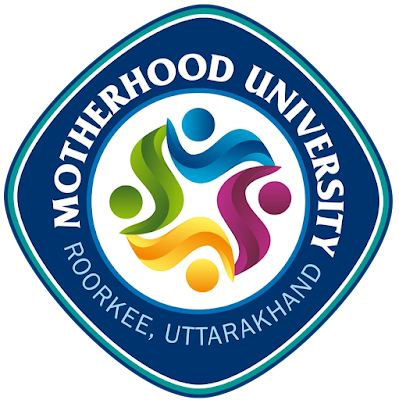
MOTHERHOOD UNIVERSITY  The emblem of Motherhood University (MU) is a squircle with a blue border bearing its name and place and has white, cyan and blue outlines. The squircle holds a white circle with a cyan outline which has four coloured swooshes with dots depicting four humans in green, blue, violet and yellow form a multifaceted personality of motherhood. The colour blue symbolises serenity, calmness, trust, spirituality, calmness, wisdom, freedom, openness, intelligence and loyalty; the colour violet denotes creativity, wisdom, sensitivity, spirituality, nobility, ceremony, mystery, enlightenment, future, imagination, dreams and wealth; the colour yellow means happiness, energy, vitality, focus and creativity and the colour green represents agriculture, nature, growth, balance, harmony, environment, prosperity, vitality, prestige and wealth and. Overall the emblem is bold, vibrant and attractive.

SHRI KHUSHAL DAS UNIVERSITY

Image
SHRI KHUSHAL DAS UNIVERSITY Shri Khushal Das University (SKDU) established in 1956 by the Shri Guru Govind Singh Charitable Trust. The emblem of the university is a dark blue squircle hosting a shield with motifs of a book supporting a woman and a man holding a torch. The motif also looks like a mortarboard hat. Below the shield the motto of the university in Sanskrit ‘ज्ञानम् परमम् प्येयम्’, which means ‘Knowledge is the Ultimate Drink’. The squircle has a white inner border line. A squircle symbolises the value of the rational mind - square, also referring to the natural insights of intuition - circle. The mortarboard hat or Oxford hat denotes educational achievement, equality, tradition and rights of passage; the book symbolises knowledge and wisdom; the torch symbolises enlightenment and hope and represents life, truth and the regenerative power of flame and the two human beings are the stakeholders of the university. The colour blue symbolises serenity, calmness, tr

VIDHARBHA KONKAN GRAMIN BANK

Image
VIDHARBHA KONKAN GRAMIN BANK Vidharbha Konkan Gramin Bank (VKGB) came into existence on February 28, 2013 through amalgamation of erstwhile Wainganga Krishna Gramin Bank, Solapur and Vidharbha Kshetriya Gramin Bank, Akola, Maharashtra State. The emblem of the bank is in the form of a squircle with green border with the monogram of ‘वि’ and ‘को’ with a banner at the bottom bearing the words ‘ग्रामीण बँक’. The monogram has been treated like a pair of fish in blue and green around the vertical stroke ensconcing a mango and guava. The upper strokes of both the Devanagari are interestingly depicted like a dome, giving a feel of stateliness and credibility; the fish, mango and guava denotes the major focus areas of bank’s service and its tagline in Marathi ‘विकासासाटी समर्पित’ meaning ‘Dedicated to Development’ is placed below the banner. The colour blue denotes the vast opportunities it opens up for the stakeholders and the trust one can repose on the bank and green denotes hop

PUNJAB NATIONAL BANK

Image
PUNJAB NATIONAL BANK Punjab National Bank (PNB), India’s first swadeshi bank, commenced its operations on April 12, 1895 from Lahore, with an authorised capital of INR 2 lakhs and working capital of INR 20,000. The bank was established by the spirit of nationalism and was the first bank purely managed by Indians with Indian capital. During the long history of the bank, nine banks have been merged or amalgamated with PNB. Its logo has a monogram and wordmark of its acronym in reddish brown and orangish yellow. The monogram using Devanagari ‘प’ in yellow with a circle representing a human being is placed in a brown squircle. The wordmark created using sans serif font with even stroke thickness and round corners in brown is placed in a yellow stadium. The colours are earthy, vibrant and strong, thereby establishing a strong bond with customers.

HPCL RAJASTHAN REFINERY LIMITED

Image
HPCL RAJASTHAN REFINERY LIMITED HPCL Rajasthan Refinery Ltd. (HRRL) was incorporated on September 18, 2013, as a Joint Venture between Hindustan Petroleum Corporation Limited (HPCL) and Government of Rajasthan (GOR) with an equity participation of 74% and 26% respectively. The project involves setting up of a Greenfield nine MMTPA refinery cum petrochemical complex at Pachpadra in Barmer district of Rajasthan. Its emblem is an adaptation of the logo of HPCL and the motifs of Rajasthan in red, blue and yellow ochre colours. The squircle border from the parent company is retained to show continuity and relationship, within a traditional arch of Rajasthan is placed supported by a motif of oil coming out from drilling. It has its acronym in blue and red colours supported by sun on sand dunes of Rajasthan. The name of the company is written in Devanagari and English at the bottom of the emblem.

BHARATIYA RESERVE BANK NOTE MUDRAN PRIVATE LIMITED

Image
BHARATIYA RESERVE BANK NOTE MUDRAN PRIVATE LIMITED Bharatiya Reserve Bank Note Mudran Private Limited (BRBNMPL) was established by Reserve Bank of India (RBI) as it's wholly owned subsidiary on February 3, 1995, with a view to augmenting the production of bank notes in India to enable the RBI to bridge the gap between the supply and demand for banknotes in the country. The company manages two presses one at Mysore, Karnataka and the other at Salboni, West Bengal. The present capacity of both the presses is 16 billion note pieces per year on a two shift basis. Its emblem has two rollers depicting a printing press and an unprinted sheet goes through it and comes out printed. These are kept in a thick safe diagonally placed squircle shaped enclosure in grey colour. The colour grey stands for reliability and strength and the cyan stands for vibrancy and dynamism.