Posts

Showing posts from January, 2023

ALL INDIA INSTITUTE OF MEDICAL SCIENCES NEW DELHI

Image
ALL INDIA INSTITUTE OF MEDICAL SCIENCES NEW DELHI The health survey and development committee, chaired by Sir Joseph Bhore, an Indian Civil Servant, had in 1946 recommended the establishment of a national medical centre which would concentrate on meeting the need for highly qualified manpower to look after the nation's expanding health care activities. A grant from New Zealand under the Colombo Plan made it possible to lay the foundation stone of All India Institute of Medical Sciences (AIIMS) in 1952. The AIIMS was created in 1956, as an autonomous institution through an Act of Parliament, to serve as a nucleus for nurturing excellence in all aspects of health care. Its circular insignia has a traditional symbol of the Caduceus to represent medicine. This symbol derives from Hermes or Mercury, the winged messenger and is a staff intertwined by two snakes. The staff is topped by a lotus representing India. A circular border ensconces this motif with its name in Devanaga

ADANI ENTERPRISES LIMITED

Image
ADANI ENTERPRISES LIMITED Adani Enterprises Limited (AEL) is the flagship company of the Adani Group, one of India’s largest business organisations. Over the years, Adani Enterprises has focused on building stellar infrastructural assets contributing to nation-building. Having successfully built unicorns like Adani Transmission, Adani Power, Adani Ports SEZ, Adani Green Energy and Adani Total Gas, the company has contributed significantly to make the country self-reliant. Adani Group is an Indian diversified conglomerate with assets such as ports, power plants and mines. The new corporate identity was created by Wolff Olins. The objective was to develop a corporate brochure to sum up the company's activities to increase understanding of the group among customers, employees and the public. Wolff Olins managed to summarise most activities under three headings, resources, logistics and energy. Its logo is a wordmark written using sans serif typeface with rounded ends and eve

INDIAN INSTITUTE OF SCIENCE EDUCATION AND RESEARCH BERHAMPUR

Image
INDIAN INSTITUTE OF SCIENCE EDUCATION AND RESEARCH BERHAMPUR The Indian Institute of Science Education and Research Berhampur, established in 2016 by the Ministry of Education, Government of India is a Center of Excellence dedicated to teaching and research in basic sciences. Its red colour logo has a pictorial and a monogram of its acronym. The pictorial has the wheel of Konark Sun temple, with its name written in Devanagari on the wheel frame and its acronym in English. The wheel represents Odisha, in which Berhampur is located and the colour red symbolises Lord Jagannath, the Lord of Puri.

INDIAN INSTITUTE OF SCIENCE EDUCATION AND RESEARCH TIRUPATI

Image
INDIAN INSTITUTE OF SCIENCE EDUCATION AND RESEARCH TIRUPATI Indian Institute of Science Education and Research Tirupati (IISER Tirupati) is the sixth Institute in the chain of IISERs established by the Government of India under the Ministry of Education for imparting quality education in basic sciences in August 2015. Its logo depicts a golden spiral that grows to form an abstraction of an 'i'. The size of this spiral increases but its shape remains the same with each successive curve. The 'i' at the pinnacle depicts 'IISER the institution'. It also connotes 'individuals', implying that IISER is bound to serve people of the nation by contributing to education and research. The petals of the logo represent the national flower, lotus (Nelumbo Nucifera Gaertn). A golden spiral is a logarithmic spiral whose growth factor is the golden ratio (1.618). This ratio can be observed in numerous naturally occurring patterns and structures. The golden sp

KHELO INDIA

Image
KHELO INDIA India, in the last few years has made steady progress in the field of sports. This tremendous potential needs to be showcased at a global platform. The Khelo India Youth Games programme has been introduced to revive the sports culture in India at the grass-root level by building a strong framework for all sports played in our country and establishing India as a great sporting nation. The logo was a crowd sourced design and many chose the colours of the National flag. The three-stroke Khelo India logo was designed by Ogilvy India and offers flexibility in adapting to numerous pictorial forms.

INDIAN INSTITUTE OF SCIENCE EDUCATION AND RESEARCH THIRUVANANTHAPURAM

Image
INDIAN INSTITUTE OF SCIENCE EDUCATION AND RESEARCH THIRUVANANTHAPURAM The Indian Institute of Science Education and Research Thiruvananthapuram (IISER TVM) is dedicated to scientific research and science education of international standards in 2008. Its logo implies the beauty of infinity and integrity - the quest for infinite knowledge...the aim of integrating various branches of science...thus was born our emblem, reflecting the vision of IISER TVM; yes!...it wants to tell you what it means; because, the students and faculty of IISER TVM designed it; just have a look at it.....you will find the symbol of infinity, in a cool light blue colour; the same blue which gives beauty to the infinite sky and the deep ocean. The symbol of infinity is definitely mathematical, anyway it is not just mathematics- there are the DNA strands which hold it together; on the other side, you might see the pi, which extends and becomes one with the bonds of chemistry running through the strands.

INDIAN INSTITUTE OF SCIENCE EDUCATION AND RESEARCH BHOPAL

Image
INDIAN INSTITUTE OF SCIENCE EDUCATION AND RESEARCH BHOPAL Indian Institute of Science Education and Research Bhopal (IISERB) was established in 2008. IISER is a degree-granting autonomous institute. Its emblem has a light blue tone circle with a red atomic structure, above which two persons are celebrating. Below this its motto in Sanskrit ‘विद्ययाऽमृतमश्नुते’ meaning ‘Enjoying the Nectar of Education' is written. These are eccentrically placed inside a red bordered circle, Around which on a border its name is written in blue. This is further outlined by a red circle.

INDIAN INSTITUTE OF SCIENCE EDUCATION AND RESEARCH MOHALI

Image
INDIAN INSTITUTE OF SCIENCE EDUCATION AND RESEARCH MOHALI Indian Institute of Science Education and Research Mohali (IISER Mohali) started its academic programme in 2007, with a batch of twenty-five students in the five year BS - MS Dual Degree Program. IISER is an autonomous institution and it awards its own degrees. The insignia of IISER has a glowing traditional lamp ensconced by a blue circular border on which its name is written. Below the lamp its motto in Sanskrit ‘ज्ञानानवेषणम्’ is inscribed. Its English version ‘In Pursuit of Knowledge’ is written on a banner at the bottom. The lamp symbolises light, vision, wisdom and enlightenment.

INDIAN INSTITUTE OF SCIENCE EDUCATION AND RESEARCH KOLKATA

Image
INDIAN INSTITUTE OF SCIENCE EDUCATION AND RESEARCH KOLKATA Indian Institute of Science Education and Research Kolkata (IISER Kolkata) was established in 2006 by the Ministry of Human Resource Development (MHRD), Government of India. IISER Kolkata’s insignia has a central black dot representing its stakeholders - students, teachers and society from which the elliptical grey and blue DNA structure and grey lotus emerge, like knowledge emerges from the pages of a book. Below this its acronym and name of the place are written with bold and normal sans serif typeface.

INDIAN INSTITUTE OF SCIENCE EDUCATION AND RESEARCH PUNE

Image
INDIAN INSTITUTE OF SCIENCE EDUCATION AND RESEARCH PUNE The Indian Institute of Science Education and Research Pune (IISER Pune) is a premier institute dedicated to research and teaching in the basic sciences was established in 2006 by the Ministry of Human Resource Development. Its insignia has a red lotus with its petals looking like pages of a book emerging from a black dot symbolising the stakeholders - student, teachers and society, supported by its acronym and place in sans serif bold and normal typeface.

CHENNAI METROPOLITAN DEVELOPMENT AUTHORITY

Image
CHENNAI METROPOLITAN DEVELOPMENT AUTHORITY The functions of the Chennai Metropolitan Development Authority (CMDA) are to carry out a survey of the Chennai Metropolitan planning area and prepare reports on the surveys so carried out; to prepare a master plan or detailed development plan or new town development plan as the case may be for the Chennai Metropolitan planning area; to prepare an existing land use map and such other maps as may be necessary for the purpose of preparing any development plan; to cause to be carried out such works as are contemplated in any development plan and to designate the whole of Chennai Metropolitan planning area or any part thereof with in its jurisdiction as a new town. Its emblem is a monogram of its acronym ‘CMDA’ written in extra conjoined bold sans serif letters depicting a building structure.

AHMEDABAD URBAN DEVELOPMENT AUTHORITY

Image
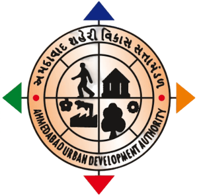
AHMEDABAD URBAN DEVELOPMENT AUTHORITY Ahmedabad Urban Development Authority (AUDA) was established on February 1, 1978 by the State Government of Gujarat. The prime objective of the AUDA's formation was to carry out the sustained planned development of the area falling outside the periphery of Ahmedabad Municipal Corporation. The important functions of the Authority include the preparation of a physical plan for the development of Ahmedabad urban agglomeration, to prepare the draft town planning schemes, to implement the revised town planning schemes and to monitor and control the development activities in accordance with the revised development plan. Its circular logo has four quadrants in the middle, with a man walking, a house, a tree and a factory. The diagonal separators act as direction markers in blue, orange, red and green meaning that AUDA covers all directions and the outer circle has a border which carries its name in Gujarati and English.

INDIAN INSTITUTE OF INFORMATION TECHNOLOGY RAICHUR

Image
INDIAN INSTITUTE OF INFORMATION TECHNOLOGY RAICHUR The Indian Institute of Information Technology, Raichur has been brought into existence as a registered society, through the IIIT Laws (Amendment) Act 2020 which in turn has amended the IIIT (PPP) Act 2017 by inserting the name of this Institute in the schedule thereof. The designers of the symmetrical IIIT Raichur logo had considered different factors incuding the reproduction cost, as the logo will be printed on various materials and surfaces the colours are kept to a minimum in order to keep the printing process simpler and economic. The concept evolved from many ideas and some of the key features are generated from the philosophy of IIIT. IIITs are known for their excellence in teaching and research and it continues without stopping and it has no limits. The logo is designed by Prof. Deepak John Mathew, Department of Design, IIT Hyderabad.

INDIAN INSTITUTE OF INFORMATION TECHNOLOGY AGARTALA

Image
INDIAN INSTITUTE OF INFORMATION TECHNOLOGY AGARTALA Indian Institute of Information Technology Agartala (IIIT-Agartala), is one of the Indian Institutes of Information Technology (PPP) in the country, set up with the objective of making available facilities for higher education, research and training in various fields of Information Technology. The three ‘i’s are arranged as the radius of a circle, with an orange dot forming their top. This arrangement also forms the letter ‘T’, which is supported by ‘o’ on left and ‘A’ on right. ‘A’ stands for Agartala and ‘O’ stands for binary along with one of the radius. All these are ensconced in a circle on the border of which its name and place are written.

INDIAN INSTITUTE OF INFORMATION TECHNOLOGY BHAGALPUR

Image
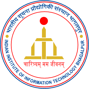
INDIAN INSTITUTE OF INFORMATION TECHNOLOGY BHAGALPUR Indian Institute of Information Technology, Bhagalpur (IIIT Bhagalpur) is one of the IIITs set up by MHRD, Govt of India in Public Private Partnership (PPP) mode. It started functioning from the academic year 2017. Bhagalpur is known as the silk city, so the letters IIIT are designed to imitate the weaving pattern done in Bhagalpuri Saree. The geometric structure takes inspiration from the main stupa at the centre of Vikrasmshila Mahavidyalaya situated 38 kilometres from Bhagalpur. Technically the profile and shape of the entire logo resembles the NOT gate of a digital circuit resembling the inclination of the institute towards IT. The Red dot symbolises the rising sun. The colour palette is taken from the IIT Guwahati logo as IITG is the mentor for IIIT Bhagalpur. The logo as a whole signifies the rise of the institute. Its motto in Sanskrit is ‘चारित्रयम् मम जीवनम्’ meaning ‘The Three Characters are My Life’.

INDIAN INSTITUTE OF INFORMATION TECHNOLOGY BHOPAL

Image
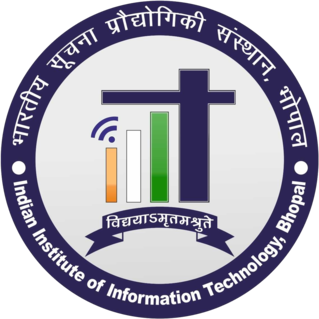
INDIAN INSTITUTE OF INFORMATION TECHNOLOGY BHOPAL Indian Institute of Information Technology Bhopal (IIIT-Bhopal), is one of the IIITs in PPP model. Its emblem is circular and has a dominant blue border, on which its name is written in Devanagari and English. It ensconces its acronym as a monogram in the national tricolour. The dot of first ‘i’ is depicted as a ‘WiFi’ symbol and the t’s horizontal stroke is extended towards left to give symmetry and balance to the logo. Its motto ‘विद्ययाऽमृतमश्नुते’ in Sanskrit meaning ‘Education is Equivalent to Nectar’ is written on a banner below the monogram.

INDIAN INSTITUTE OF INFORMATION TECHNOLOGY SURAT

Image
INDIAN INSTITUTE OF INFORMATION TECHNOLOGY SURAT Indian Institute of Information Technology Surat (IIITS) is an Institute of National Importance established under the Act of Parliament 2017, by erstwhile Ministry of Human Resource Development (MHRD), Government of India, on not-for-profit and in Public Private Partnership basis. Its emblem has a blue bordered white shield, has sun and two individuals supported by ‘IIIT’ in the national tricolours. The shield is the guarding and protecting the learners and the sun symboilises knowledge and growth. The abstract presentation of the acronym is a symbolism of programming code. At the bottom, its motto in Sanskrit ‘ज्ञाने च उध्यमे सर्व प्रतिष्ठितम्’ meaning ‘Everything is Achieved through Knowledge and Hard Work’ is written.

INDIAN INSTITUTE OF INFORMATION TECHNOLOGY RANCHI

Image
INDIAN INSTITUTE OF INFORMATION TECHNOLOGY RANCHI Indian Institute of Information Technology Ranchi is an autonomous institute setup by the MoE, Government of India and Government of Jharkhand along with the industry partners TTL, TCS and CCL on a Public Private Partnership. The outermost layer of its emblem is branched into two very unique concepts. One the Frequency Modulation - which has acted as a revolutionary technology in the field of communication and the other is the waves resembling the rays of the glorious Sun depicting the mission of the college i.e. to light up the path of knowledge for the pupil and also providing them with energy, force, strength. The name of the college is concentrically arched in both Hindi and English. And completing it lies an open book at the base giving it an essence of the will to learn more and more. This logo is centralised by an antenna, which has a great significance in the advancement of communication technology. Around th

INDIAN INSTITUTE OF INFORMATION TECHNOLOGY SENAPATI MANIPUR

Image
INDIAN INSTITUTE OF INFORMATION TECHNOLOGY SENAPATI MANIPUR Indian Institute of Information Technology Senapati, Manipur (IIITM) is an institution under Ministry of Higher Education, Government of India. It was established in 2015 in order to develop Manipur as a preferred destination for Information Technology (IT) related manpower and industry. Its emblem has a blue circle representing globe, in which the acronym ‘IIIT Manipur' is written. The acronym is supported by 'm' in the form of waves symbolising information technology and a multicolour swoosh goes through the centre of the globe meaning the dynamism and its vibrancy in the field of IT education.

INDIAN INSTITUTE OF INFORMATION TECHNOLOGY, DESIGN AND MANUFACTURING KURNOOL

Image
INDIAN INSTITUTE OF INFORMATION TECHNOLOGY, DESIGN AND MANUFACTURING KURNOOL Indian Institute of Information Technology, Design & Manufacturing, Kurnool (IIITDMK) was announced in 2014 after receiving the assent of President of India to the Institutes of Information Technology Act, 2014 and its subsequent publication in the Gazette of India, Extraordinary, Part- Il, Section I, on December 8, 2014. The logo is enclosed by a gear on the outer periphery. The function of the gear is to transmit the energy (motion) which symbolises that the institute believes in transferring its knowledge to the outside world for the benefit of the society. The gear is also a representation of motion which motivates the institute to always be on the move and never halt the progress of technology. Concentric to the gear is another curve which partially encloses the remaining part of the logo. The curve is open on the upper side which signifies the spirit of the institute that it believes no

INDIAN INSTITUTE OF INFORMATION TECHNOLOGY LUCKNOW

Image
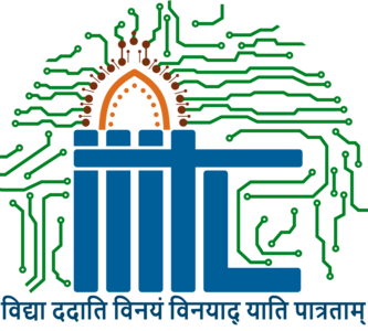
INDIAN INSTITUTE OF INFORMATION TECHNOLOGY LUCKNOW Indian Institute of Information Technology, Lucknow (IIIT Lucknow) is one of the twenty IIITs being set up by the Central Government in Public Private Partnership (PPP) mode. IIIT Lucknow admitted its first batch of B. Tech. in Information Technology with an intake of fifty students with effect from the academic session 2015-16. Its emblem is cast in the form of an arch from the prevailing Mughal architecture, in which a smaller arch in orange and brown coloured arch and nodes of an electronic circuit in green forms the hub and the shape of the logo is filled with. The acronym in blue is designed as an entrance column of an arch, with ‘I, T and L’ forming the pillars, the top stroke of the ‘T’ forming the beam. Its motto in Sanskrit ‘विद्या ददति विनयं, विनयं दादति पातरताम्’ meaning ‘Education Gives Humility, Humility Gives Character’ is placed at the bottom.

INDIAN INSTITUTE OF INFORMATION TECHNOLOGY KALYANI

Image
INDIAN INSTITUTE OF INFORMATION TECHNOLOGY KALYANI The Indian Institute of Information Technology Kalyani has been set up with an objective to produce best-in-class human resources in IT. IIIT Kalyani has been set up at Kalyani, West Bengal by Government of India, Government of West Bengal and industry partners on a Not-for-profit Public Private Partnership (N-PPP) basis. Its light blue emblem in the shape of an edged shield with thick and thin borders holds the tree of knowledge, which has a satellite receiver and its motto in Sanskrit ‘विद्याधनं सर्वधनप्रधानम्’ meaning ‘Wealth of Education is the Supreme of all the Wealth’. This is supported by a banner carrying its name and the bottom banner bearing the name of the place. The tree is supported on either side by a conch symbolising spread of divine knowledge and a pigeon symbolising peace and friendship.

INDIAN INSTITUTE OF INFORMATION TECHNOLOGY SONEPAT

Image
INDIAN INSTITUTE OF INFORMATION TECHNOLOGY SONEPAT Indian Institute of Information Technology, Sonepat (IIIT, Sonepat) is one of the Indian Institutes of Information Technology located at Sonepat, Haryana in 2014. IIIT Sonepat is a joint venture of the Government of India and the Government of Haryana with Industries in Public-Private Partnership model. The emblem of IIIT-S has a satellite and receiving antenna, supported by a pair of strokes of power that is ensconced in curved octagonal shape, on each alternative leaf which has motifs of WiFi, electronic processor, globe and a printed circuit. This assemblage is supported by a semicircular blue border at the bottom bearing the name of the Institute. The circle is completed by a pair of yellow laurels and completed by a banner bearing the year of establishment. At the button on a banner its motto in Sanskrit ‘तेजस्वी नावध्वीतमस्तु’ meaning ‘Let the Ship of Brilliance is Alerted’ is written.

INDIAN INSTITUTE OF INFORMATION TECHNOLOGY UNA

Image
INDIAN INSTITUTE OF INFORMATION TECHNOLOGY UNA Indian Institute of Information Technology Una (IIIT Una) is one of the twenty IIITs being set up, funded and managed by the Ministry of Human Resource Development, Government of India under the Public Private Partnership (PPP) model. Its emblem has a gear wheel with twelve teeth in yellow ochre, on which its name is written in Devanagari and English. It encircles a motif of WiFi, supported by a book, below which a blue sun, the Himalayan mountains with rivers flowing at the foot are depicted on a brown background. Its motto in Sanskrit ‘विद्या सर्वज्ञ गौरवः’ meaning ‘Knowledge is Omniscient Pride’ is placed at the bottom.

INDIAN INSTITUTE OF INFORMATION TECHNOLOGY TIRUCHIRAPALLI

Image
INDIAN INSTITUTE OF INFORMATION TECHNOLOGY TIRUCHIRAPALLI Indian Institute of Information Technology Tiruchirappalli (IIITT), also known as IIIT Trichy, is an Institute of National Importance and one among the 21 IIITs proposed under the non-profit Public-Private Partnership (PPP) Model by MHRD. The logo of IIITT has a black and white photograph of the gopuram of the temple of Srirangam supported by a book, surrounded by a circle of leaves and a laurel on both the sides. The gopuram or tower symbolises greatness, height and glory of education, spirituality and divinity in achievements supported by the book of knowledge. The circle of leaves adds to its nearness to nature and the laurels symbolise consistent and everlasting victories in the chosen field of education. It is unfortunate to note that an institution of ‘National Importance’ from the state of Tamilnadu - a known centre for educational excellence has a logo which needs professional touch in its execution

INDIAN INSTITUTE OF INFORMATION TECHNOLOGY VADODARA

Image
INDIAN INSTITUTE OF INFORMATION TECHNOLOGY VADODARA Indian Institute of Information Technology Vadodara (IIIT-V) is established by the Ministry of Education (MoE), Government of India under Public Private Partnership (PPP) as Institute of National Importance in the year 2013. Its circular insignia has three ‘I’s written as three solid vertical blocks and ‘T’ written with three solid square dots above them and ‘V’ written like an inverted right-angled triangle, symbolising three persons and a learning desk and computer. This is ensconced by a circular border on which its name is written in Devanagari and English. This logo is simple, straight, solid and stands out well from clutter.

INDIAN INSTITUTE OF INFORMATION TECHNOLOGY GUWAHATI

Image
INDIAN INSTITUTE OF INFORMATION TECHNOLOGY GUWAHATI Indian Institute of Information Technology Guwahati (IIITG) is an institution of National Importance under an Act of Parliament. The first convocation of the Institute was held on May 15, 2018. Its insignia in blue is a monogram of its acronym ‘IIITG’, in which three ‘I’s and ‘T’ are arranged in ascending order by size and the horizontal stroke of ‘T’ takes off as a circular loop ensconcing the ‘IIIT’. This logo appears like a well-constructed and solid building vertical columns in a nurturing environment.

INDIAN INSTITUTE OF INFORMATION TECHNOLOGY DESIGN & MANUFACTURING KANCHEEPURAM

Image
INDIAN INSTITUTE OF INFORMATION TECHNOLOGY DESIGN & MANUFACTURING KANCHEEPURAM Indian Institute of Information Technology Design and Manufacturing Kancheepuram (IIITDM Kancheepuram) is a Centre of Excellence for technical education and research established in 2007 by the Ministry of Education, Government of India to pursue design and manufacturing oriented engineering education and research and to promote the competitive advantage of Indian products in global markets. It wass one of the two IIITDMs, the other one being located in Jabalpur. It is a fully residential campus with all students residing within the campus. Its insignia is designed to appear like a human flying high and achieving success. The lower half of the logo consists of intersecting trunks which symbolises the highly interdisciplinary approach to education that the institute follows. The confluence of the three core branches with design is also communicated through this. The upper half of the logo is ma

PANDIT DWARKA PRASAD MISHRA INDIAN INSTITUTE OF INFORMATION TECHNOLOGY DESIGN & MANUFACTURING, JABALPUR

Image
PANDIT DWARKA PRASAD MISHRA INDIAN INSTITUTE OF INFORMATION TECHNOLOGY DESIGN, JABALPUR & MANUFACTURING Pandit Dwarka Prasad Mishra Indian Institute of Information Technology Design & Manufacturing (PDPM IIITDM) Jabalpur was established by the Ministry of Human Resource Development on January 24, 2005, under Madhya Pradesh Society Registration Act 1973. Its emblem appears like a computer monitor created using its acronym in green and blue colours. The three spherical water drop shapes in blue tones with a green head created by using three ‘i’s on the monitor screen represent IT, design and manufacturing.

ATAL BIHARI VAJPAYEE INDIAN INSTITUTE OF INFORMATION TECHNOLOGY AND MANAGEMENT GWALIOR

Image
ATAL BIHARI VAJPAYEE INDIAN INSTITUTE OF INFORMATION TECHNOLOGY AND MANAGEMENT GWALIOR Indian Institute of Information Technology and Management (IIITM) in Gwalior, Madhya Pradesh is an autonomous institute set up by Government of India, MHRD of Government of India) in 1997. The emblem of the Institute has three ‘I’s not only form the ‘M’ but also the crown of ‘T’. The pattern ensembles the three I’s, one M and one T meaningfully and aesthetically. The concentric circles represent a bird’s eye view, a comprehensive approach to academics, training and consultancy. The dot represents the institute’s focus on IT and management, core areas of specialisation. Blue is the colour of knowledge and depth is signified by its dark shade knowledge is a fathomless ocean. The Sanskrit phrase ‘विश्वजीवनामृतं ज्ञानम्’ meaning ‘Knowledge is Nectar of Life’ forms the base or foundation of this logo design.

LUCKNOW SUPER GIANTS

Image
LUCKNOW SUPER GIANTS Lucknow Super Giants (LSG) is a franchise cricket team based in Lucknow, Uttar Pradesh. They play in the Indian Premier League (IPL). The Lucknow franchise formed in 2021. Sanjeev Goenka is its principal owner. This team is expected to play its home matches at the BRSABV Ekana Cricket Stadium in Lucknow. The team’s logo is a mixture of wings painted in tricolour along with a bat and a ball. Revealing the story behind their logo, Lucknow Super Giants said the team's brand identity draws inspiration from ancient Indian mythology. “The mythical bird Garuda- who is a protector and enthroned with the power to move swiftly, has inspired us to create the winged emblem of the team. Garuda is omnipresent in every Indian culture and subculture," the franchise said in a statement. The tricolour wings of the entity symbolically represent Lucknow Super Giants' pan India appeal. The body of the bird has been formed by a blue coloured bat to signify th