Posts

Showing posts from December, 2023

DIRECT BENEFIT TRANSFER IN AGRICULTURE

Image
DIRECT BENEFIT TRANSFER IN AGRICULTURE The blue, green and purple emblem of Direct Benefit Transfer in Agriculture (DBTA) has a pair of hands supporting the Rupee symbol promoting a tree with green leaves. These are ensconced by an inverse blue arc on which ‘DBT Agri Portal’ is inscribed.

MAHALANOBIS NATIONAL CROP FORECASTING CENTRE

Image
MAHALANOBIS NATIONAL CROP FORECASTING CENTRE The emblem of Mahalanobis National Crop Forecasting Centre (MNCFC) has its acronym written in green sans serif bold typeface with a pair of crests of cereal circumscribed by a satellite denoting the forecasting functions practised by using technologies by the Centre.

DIRECTORATE OF ECONOMICS AND STATISTICS

Image
DIRECTORATE OF ECONOMICS AND STATISTICS The circular emblem of the Directorate of Economics and Statistics (DES) has a green and yellow border bearing its name in Devanagari and English. This border ensconces agricultural produces like fruits, vegetables, cereals and others, representing the scope of the Directorate. Over this background 'E&S' is written.

NATIONAL COOPERATIVE DEVELOPMENT CORPORATION

Image
NATIONAL COOPERATIVE DEVELOPMENT CORPORATION The green circular emblem of National Cooperative Development Corporation (NCDC) has a rising sun supported by a pair of shaking hands and its motto in Devanagari ‘सहयोग’ meaning ‘Collaboration’. The shaking hands refers to cooperation and collaboration and the rising sun refers to the future of these endeavours, which is bright, path breaking and enriching. These motifs are ensconced by a circular border with decorative elements inscribed on which the name of the Corporation in Devanagari and English.

BAJAJ FINANCE LIMITED

Image
BAJAJ FINANCE LIMITED The logo of Bajaj Finance Limited (BFL) is a blue rectangle in which its name is inscribed in white with sans serif bold typeface, the horizontal strokes of which end with a shear, giving the logo a distinct character. The light blue colour gives a feeling of confidence, trust and reliability which any finance company has to build.

MADHUSUDAN INSTITUTE OF CO-OPERATIVE MANAGEMENT

Image
MADHUSUDAN INSTITUTE OF CO-OPERATIVE MANAGEMENT  The blue and red circular emblem of Madhusudan Institute of Co-operative Management (MICM) has a motif of traditional lamp with flame, the halo of which is circumscribed by its name in Devanagari. Below the lamp, its motto in Sanskrit is written. All these are ensconced by a pair of blue circular lines. The traditional lamp symbolises light, illumination, awakening, devotion, purity, guidance, protection, hope and prosperity.

NATIONAL AGRICULTURAL HIGHER EDUCATION PROJECT

Image
NATIONAL AGRICULTURAL HIGHER EDUCATION PROJECT  The orange and green emblem of National Agricultural Higher Education Project (NAHEP) is a wordmark created with sans serif bold capitals with the letter ‘A’ transformed into a green leaf and the letter ‘E' with a mortarboard hat. These motifs refer to agriculture and higher education respectively. The colour orange represents energy, vitality, creativity, inspiration, joy and happiness and the colour green symbolises agriculture, nature, growth, balance, harmony, environment, prosperity, vitality, prestige, wealth and being very down to earth.

APEDA AGRI EXCHANGE

Image
APEDA AGRI EXCHANGE The green and light grey logo of APEDA Agri Exchange (APEDAAE) is a wordmark with its name written in green and light grey. The letter ‘X’ is written in three dimensions with two and a half times x-height. Its tagline ‘The Changing Face of Agri-business’. This simple, direct and low profile meaning business and is neutral in the process of its business. The colour green means agriculture, nature, growth, balance, harmony, environment, prosperity, vitality, prestige, wealth and being very down to earth and the colour grey means strength, longevity, unemotional, detached, balanced and impartial, power, influence, wisdom and intelligence.

ICAR- NATIONAL BUREAU OF ANIMAL GENETIC RESOURCES

Image
ICAR- NATIONAL BUREAU OF ANIMAL GENETIC RESOURCES The emblem of ICAR- National Bureau of Animal Genetic Resources (ICAR-NBAGR) is a monogram in the form of a cattle using its acronym ‘NBAGR’ in dark blue colour. The colour blue symbolises serenity, calmness, trust, spirituality, calmness, wisdom, freedom, openness, intelligence and loyalty.

PGS-INDIA (PARTICIPATORY GUARANTEE SYSTEM OF INDIA) - ORGANIC

Image
PGS-INDIA (PARTICIPATORY GUARANTEE SYSTEM OF INDIA) - ORGANIC The blue and green emblem of PGS-India (Participatory Guarantee System of India) - Organic has a pair of hands depicted as grass holding a ball of blue water denoting that no chemical is used in its cultivation and production. Below the motif its name is written in sans serif typeface. The colour blue symbolises serenity, calmness, trust, spirituality, calmness, wisdom, freedom, openness, intelligence and loyalty and the colour green symbolises agriculture, nature, growth, balance, harmony, environment, prosperity, vitality, prestige, wealth and being very down to earth.

PGS-INDIA (PARTICIPATORY GUARANTEE SYSTEM OF INDIA) - GREEN

Image
PGS-INDIA (PARTICIPATORY GUARANTEE SYSTEM OF INDIA) - GREEN The red and green emblem of PGS-India (Participatory Guarantee System of India) - Green has a pair of hands depicted as grass holding a ball of red denoting that a product is from a farm that is in the process of becoming organic and has stopped using chemicals in its cultivation and production. Below the motif its name is written in sans serif typeface. The colour red symbolises passion, power, strength, courage, determination, energy and celebration and the colour green symbolises agriculture, nature, growth, balance, harmony, environment, prosperity, vitality, prestige, wealth and being very down to earth.

INDIA ORGANIC

Image
INDIA ORGANIC The India Organic is granted on the basis of compliance with the National Standards for Organic Production (NSOP). The blue, brown and green emblem symbolises the rhythm of cosmic and earth forces represented by the blue and brown waves of force and energy and it celebrates the essence of nature. The cosmic force in blue symbolizes earth’s environment, universal purity, richness of soil, nourished with natural ingredients in organic farming. The colour brown symbolises earth and its richness and energy. The plant in green is the colour of nature and natural products produced without using chemicals.

NATIONAL BUREAU OF FISH GENETIC RESOURCES

Image
NATIONAL BUREAU OF FISH GENETIC RESOURCES The emblem of National Bureau of Fish Genetic Resources (NBFGR) has a blue colour motif of fish combined with that of DNA structure holding the acronyms of the Bureau in Devanagari and English.   

NATIONAL COUNCIL FOR CO-OPERATIVE TRAINING

Image
NATIONAL COUNCIL FOR CO-OPERATIVE TRAINING The emblem of National Council for Co-operative Training (NCCT) has a yellow circle in which its acronym ‘NCCT’ and ‘New Delhi’ are placed with a red roof and crested by a traditional lamp. These are ensconced by a border with blue outlines on which its name is inscribed in Devanagari and English. The circular seal is supported by a pair of laurels on sides and a pair hands shaking at the bottom. The lamp represents  light, illumination, awakening, devotion, purity, guidance, protection, hope and prosperity and roof refers to working together in cooperation; the laurels refer to ceremonies, victory, achievement, hard work and dedication; the pair of shaking hands denote camaraderie and cooperation and the colour yellow symbolises  happiness, energy, vitality, focus and creativity.

NATIONAL RESEARCH CENTRE FOR SOYBEAN

Image
NATIONAL RESEARCH CENTRE FOR SOYBEAN The green and yellow seal of  National Research Centre for Soybean (NRCS) has a yellow gear wheel which houses the motif of a green soybean twig with three leaves and three pods of soybean. These are ensconced by a blue circular border on which the name of the Centre is inscribed in Devanagari and English. A pair of soya beans are placed on the gear. The gear wheel denotes interconnectedness, efficiency, precision, progress, advancement, synchronisation, timing, order and structure; the colour yellow symbolises happiness, energy, vitality, focus and creativity and the colour blue denotes serenity, calmness, trust, spirituality, calmness, wisdom, freedom, openness, intelligence and loyalty. 

NATIONAL RESEARCH CENTRE ON POMEGRANATE

Image
NATIONAL RESEARCH CENTRE ON POMEGRANATE The seal of National Research Centre on Pomegranate (NRCP) is an oval housing a picture of a pomegranate with a stem and a pair of leaves in a white background supported by its motto in Sanskrit ‘औषधी रसपरीपूर्णम् दाडीमम सु-वर्णम’ meaning ‘Pomegranate is Full of Medicinal Juice and has a Good Colour’ on a green background. These are ensconced by an oval border with orange outlines bearing the name and place of the Centre in Devanagari and English.  The colour green symbolises agriculture, nature, growth, balance, harmony, environment, prosperity, vitality, prestige, wealth and being very down to earth.

INFOSYS

Image
INFOSYS The logo of Infosys in blue colour with sans serif typeface with varying stroke thickness and interesting kernings was created by Ray and Kesavan Graphic Design Studio. The joined letters convey the smooth, unified bonding of values of trust, quality, consistency and longevity for which the company stands for. The colour blue symbolises serenity, calmness, trust, spirituality, calmness, wisdom, freedom, openness, intelligence and loyalty.

SBI LIFE INSURANCE COMPANY LTD.

Image
SBI LIFE INSURANCE COMPANY LTD The logo of SBI Life Insurance Company Ltd. (SBILIC), is a wordmark with the cyan emblem of State Bank of India placed on the left. The wordmark has SBI written in bold sans serif capitals with ‘B’’s counters kept open and the ‘life’ is written in purple to blue colours. Below this its tagline ‘Apne Liye. Apno ke Liye’ is written in a thin sans serif black font. This logo informs the relationship it has with the parent company SBI and a strong and supporting corporate for its customers.

NATIONAL RESEARCH CENTRE ON PLANT BIOTECHNOLOGY

Image
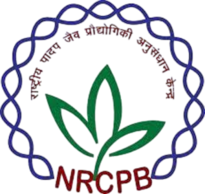
NATIONAL RESEARCH CENTRE ON PLANT BIOTECHNOLOGY The emblem of National Research Centre on Plant Biotechnology (NRCPB) has a green twig having three leaves surmounted by its name in Devanagari and circumscribed by a blue chain resembling biological material and supported by its acronym NRCPB in brown. The colour blue symbolises serenity, calmness, trust, spirituality, calmness, wisdom, freedom, openness, intelligence and loyalty; the colour green denotes agriculture, nature, growth, balance, harmony, environment, prosperity, vitality, prestige, wealth and being very down to earth and the colour brown represents earthiness, simplicity, stability, humility, warmth, reliability, endurance, timelessness and tradition.

NATIONAL FOOD SECURITY MISSION

Image
NATIONAL FOOD SECURITY MISSION The emblem of National Food Security Mission (NFSM) has a circle in the tones of yellow in which a pair of palms holding a growing plant in the tones of green. These are circumscribed by its name in Devanagari and English. These motifs aptly represent food and food security for the nation. The colour yellow denotes happiness, energy, vitality, focus and creativity; the colour green denotes agriculture, nature, growth, balance, harmony, environment, prosperity, vitality, prestige, wealth and being very down to earth and the colour brown denotes earthiness, simplicity, stability, humility, warmth, reliability, endurance, timelessness and tradition.

NATIONAL AGRICULTURAL COOPERATIVE MARKETING FEDERATION OF INDIA LTD.

Image
NATIONAL AGRICULTURAL COOPERATIVE MARKETING FEDERATION OF INDIA LTD. The green emblem of National Agricultural Cooperative Marketing Federation of India Ltd., (NAFED) has a ‘pair of hands shaking’ symbolising cooperation and federalism and a pair of supporting laurels referring to ceremonies, victory, achievement, hard work and dedication. The acronym of the organisation is placed as a wordmark below the motif.

CHAUDHARY CHARAN SINGH NATIONAL INSTITUTE OF AGRICULTURAL MARKETING

Image
CHAUDHARY CHARAN SINGH NATIONAL INSTITUTE OF AGRICULTURAL MARKETING The emblem of Chaudhary Charan Singh National Institute of Agricultural Marketing (NIAM) has its acronym NIAM written in capital letters and supported by a pair of golden laurels. The laurels represent ceremonies, victory, achievement, hard work and dedication; the colour green denotes agriculture, nature, growth, balance, harmony, environment, prosperity, vitality, prestige, wealth and being very down to earth and the colour gold denotes wealth, prosperity, power, prestige and achievement.

SMALL FARMERS’ AGRI-BUSINESS CONSORTIUM

Image
SMALL FARMERS’ AGRI-BUSINESS CONSORTIUM The green and brown emblem of Small Farmers’ Agri-Business Consortium (SBAC) has a pictorial of three green leaves supported joyfully by two men and a woman, symbolising the nature of the business of the consortium. A wordmark of its acronym is placed on the right and its name is written below that in Devanagari. Overall, the logo emphasises the collective endeavour of small farmers effectively.

UPL LTD

Image
UPL LTD The logo of UPL Ltd (UPL) with about six overlapping colour tones from yellow to orange and pink denote constant movement and evolution. This emblem also symbolises sustainable evolution with new possibilities producing new and imaginative shapes and colours. This logo is vibrant, colourful, energetic and is exciting. The name of the corporation is written in crisp and thin sans serif typeface and ‘OpenAg’ is written below its name in black. 

HCL TECHNOLOGIES LTD

Image
HCL TECHNOLOGIES LTD The blue colour logo of HCL Technologies Ltd (HCLTech) created with a sans serif medium typeface in capitals and lowercase. The font is clean and crisp with the corner of ‘L’ curved. It serves to give it the energy, innovation and technological prowess that HCL stands for. It also aims to be the symbol of supercharging progress of the organisation.

TECH MAHINDRA LTD

Image
TECH MAHINDRA LTD The grey and red logo of Tech Mahindra Ltd (TM) is written in two lines with a word in each line. It uses a sans serif bold custom finished typeface with low x-height. The endings of the strokes have an angular chisel cut finish and all the corners except one are round in all the letters. This stands for resilience and fighting for the greater good and symbolises precision, perfection, trust and reliability. The colour grey symbolises strength, longevity, unemotional, detached, balanced and impartial, power, influence, wisdom and intelligence and the colour red represents passion, power, strength, courage, determination, energy and celebration.

DIVI’S LABORATORIES LTD

Image
DIVI’S LABORATORIES LTD The logo of Divi’s Laboratories Ltd. is a red oval seal in which its name is written using calligraphic style with an outline. Thi seal presents a classic look which is reliable and trustworthy as a pharmaceutical brand. The colour red symbolises passion, power, strength, courage, determination, energy and celebration.

HDFC LIFE INSURANCE COMPANY LTD.

Image
HDFC LIFE INSURANCE COMPANY LTD The red and blue logo of HDFC Life Insurance Company Ltd (HDFLIC) has a pictorial and a wordmark supported by its tagline ‘Sar Utha ke Jiyo’. The pictorial is a very thick bordered square in two tones of red representing the assured safety and security. The wordmark has ‘HDFC’ written in its corporate sans serif font and ‘Life’ is written in blue capital and lowercase bold script typeface. Its tagline is written in red handwritten script. The colour red symbolises passion, power, strength, courage, determination, energy and celebration and blue symbolises serenity, calmness, trust, spirituality, calmness, wisdom, freedom, openness, intelligence and loyalty.

EICHER MOTORS LTD

Image
EICHER MOTORS LTD The red and grey logo of Eicher Motors Ltd has a pictorial of a galloping  horse in red and its name written below in grey. The galloping horse refers to its base energy and speed, which represents victory and success. The colour red denotes passion, power, strength, courage, determination, energy and celebration and the colour grey denotes strength, longevity, unemotional, detached, balanced and impartial, power, influence, wisdom and intelligence. Overall this logo aptly suits the automobile industry by its symbolism, legibility and attractiveness.

JSW STEEL LTD.

Image
JSW STEEL LTD. The logo of JSW Steel Ltd. is a monogram of ‘JSW’ along with a wordmark. The monogram is formed in blue and red with forms of clay blocks to depict the versatile nature of steel. The colour blue symbolises serenity, calmness, trust, spirituality, calmness, wisdom, freedom, openness, intelligence and loyalty and the colour red signifies passion, power, strength, courage, determination, energy and celebration.

TATA CONSULTANCY SERVICES LTD.

Image
TATA CONSULTANCY SERVICES LTD. The colourful logo of Tata Consultancy Services Ltd. (TCS) has a monogram and a wordmark. The monogram using ‘TCS’ is created using lowercase sans serif typeface in warm tones with a three dimensional feel and its name on the right in blue in three lines. The logo is stated to be designed by Siegel+Gale with pink as the accent colour to infuse modernity and trendiness to bring out emotion and bring out character of the brand. The wordmark is written using the corporate blue colour of the Tata’s.

NESTLE INDIA LTD

Image
NESTLE INDIA LTD The brown logo of Nestle India Ltd has evolved from its family’s coat of arms as a trademark with a single bird to its current form of three birds and a nest over the years of its existence. In German it means ‘nest’. The current logo has a mother bird feeding two young birds in a nest on a branch with a leaf, thereby creating a visual connection with its cereal products for infants. The name of the company is written below the pictorial using sans serif type in capital and lowercase with round corners and ‘N’ having an elongated horizontal stroke.  

WIPRO

Image
WIPRO The multicoloured logo or brand mark of Wipro depicts a sense of fluidity, resourcefulness, optimism and connectivity. The multiple colours demonstrate modernity and brand heritage. The elements in the logo represent  ideas, insights, technologies, industries and geographies. The expanding pattern means a boundless organisation. The four concentric circles represent the corporate’s values, employees, clients and partners and communities. The blue of the wordmark creates a sense of serenity, calmness, trust, spirituality, calmness, wisdom, freedom, openness, intelligence and loyalty. The dots in multiple colours symbolise energy and optimism.

DR REDDY’S LABORATORIES LTD

Image
DR REDDY’S LABORATORIES LTD The logo of Dr Reddy’s Laboratories Ltd with wordmark and a pictorial in purple colour is a heart and circle placed with its name. The heart denotes empathy and caring and the circles symbolise dynamism and responsiveness. The colour purple represents creativity, royalty, nobility, wisdom, luxury, power and ambition.

KLE TECHNOLOGICAL UNIVERSITY

Image
KLE TECHNOLOGICAL UNIVERSITY The insignia of KLE Technological University (KLETU) is a red squircle with a monogram of its acronym placed with a head and its name placed at the bottom separated by a line. The monogram looks dynamic and with the motif of a human, it feels dynamic and forward looking. The colour red denotes passion, power, strength, courage, determination, energy and celebration. 

KUVEMPU UNIVERSITY

Image
KUVEMPU UNIVERSITY The seal of Kuvempu University (KU) is  held by a pair of hands with its motif of Gandaberunda in a circle and ensconced by a circular border carrying the motto of the university in Kannada ‘ಮನುಜಮತ, ವಿಶ್ವಪಥ, ಸರ್ವೋದಯ, ಪೂರ್ಣದೃಷ್ಟಿ’ meaning ‘Manujamata, Vishvapatha, Sarvodaya Purnadrishti’. The banners at the bottom carry the name of the university in Kannada and English. The Gandaberunda is taken from the State Emblem of Karnataka to give unique native orientation to the emblem.