Posts

Showing posts with the label Red Black

RISHIKESH YOG KENDRA

Image
RISHIKESH YOG KENDRA The emblem of Rishikesh Yog Kendra has a black crescent supporting a person doing yoga with a red colour symbol of heart. Its name is written on the right in black sans serif capitals and lowercase. 

HETALS YOG CLINIC

Image
HETALS YOG CLINIC The insignia Hetals Yog Clinic is a red colour motif of a person doing yoga supported by its name in black italics capitals and lowercase typeface. The logo is eminently attractive and bold.

INDIAN ARC ASSOCIATION

Image
INDIAN ARC ASSOCIATION  The red and black emblem of Indian ARC Association (IARCA) is a monogram of ‘IAA’ created like building blocks used for constructing this logo. Below the monogram, its name is written in sans serif italics in capitals and lowercase in black. The emblem is bold, bright and attractive.

PLAY GAMES24X7 PVT. LTD

Image
PLAY GAMES24X7 PVT. LTD The red and black logo of Play Games24x7 Pvt. Ltd has  a pictorial of a red circle on which a white circle is placed eccentrically and in which a red cricket ball is placed. At the right its name is written in sans serif bold in black and red. The ‘11’ in red is bigger than the other letters. The logo for this gaming application is bold, strong and interesting to the target audience.

DARSHAN UNIVERSITY

Image
DARSHAN UNIVERSITY The red and black emblem of Darshan University (DU) has an U-shaped shield housing the monogram of ‘DU’ and three stripes cut through its left top edge. Below the shield its motto in Sanskrit ‘योगः कर्मसु कौशलम्’ (Verse 50, Chapter 2, Bhagavad Gita) meaning ‘Yoga is Skill in Action’ is written. At the right the name of the university is written in sanserif bold and thin typeface in black. The shield symbolises protection, courage, heritage, authority and bravery and the colour red denotes passion, power, strength, courage, determination, energy and celebration.

NOBLE UNIVERSITY

Image
NOBLE UNIVERSITY The emblem of Noble University (NU) is a monogram in black and red created using its acronym in the form of a shield and crested by a mortarboard hat. The mortarboard hat or oxford hat symbolises educational achievement, equality, tradition and rights of passage; the shield denotes protection, courage, heritage, authority and bravery; the colour black denotes mystery, power, elegance and sophistication and the colour red denotes passion, power, strength, courage, determination, energy and celebration.

GAUTAM BUDDHA UNIVERSITY

Image
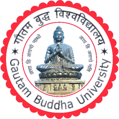
GAUTAM BUDDHA UNIVERSITY The circular emblem of Gautam Buddha University (GBU) is placed on a spread of lotus with 40 petals, which houses a picture of Gautama Buddha sitting in Dharmachakra pose supported by its tagline in Sanskrit ‘अत्ता हि अत्तनो नाथो अत्ता हि अत्तनो गति’ (Verse 160, Dhammapada) meaning ‘One's Refuge is Within Oneself’ is placed in a circle with red outline. Between the lotus petals and the motifs on a white circular border, the name of the university is inscribed in Devanagari and English. The Dharmachakra pose symbolises the  setting into motion of the wheel of the teaching of the Dharma; lotus symbolises purity, enlightenment, rebirth, transformation, personal growth, resilience, overcoming obstacles and divine beauty; the colour red symbolises passion, power, strength, courage, determination, energy and celebration and the colour black denotes mystery, power, elegance and sophistication.

MAHINDRA UNIVERSITY

Image
MAHINDRA UNIVERSITY  The insignia of Mahindra University has a monogram using its acronym ‘MU’ in red and a wordmark. The monogram is the result of the intersection of ‘’U’ and ‘M’ resulting in an upward pointing arrow and the wordmark is written with sans serif bold on the right of the monogram. Below its name, its motto ‘Global Thinkers. Engaged Leaders’ is written in grey. The colour red symbolises passion, power, strength, courage, determination, energy and celebration and the colour black denotes mystery, power, elegance and sophistication.

CHITKARA UNIVERSITY

Image
C HITKARA UNIVERSITY In the year 2002, Chitkara Educational Trust established its Punjab campus near Chandigarh. Chitkara University was established through The Chitkara University Act in 2010. The insignia has a red squircle depicting arrows in soaring heights, promising everlasting progress. It also illustrates the interlinking of our key stakeholders namely students, parents, faculty, alumni, industry and society as a whole, working in synergy towards a common goal which is the everlasting success of each Chitkara student and creating them as responsible citizens. The colour red denotes energy and passion to explore one’s potential. On its right its name is written in two lines in sans serif extra bold and serif capitals in black.

SANJAY GHODAWAT UNIVERSITY

Image
SANJAY GHODAWAT UNIVERSITY Sanjay Ghodawat University (SGU) was established as a State Private University in the year 2017. Previously it was known as Sanjay Ghodawat Institute, which was formed in the year 2009 by the Chairman of SG Group, Sanjay Ghodawat. The university’s emblem has a shield bearing five stars and a symbol of sun with its acronym written in black. The shield stands for the defence of great moral force that nature contains in it. The five stars that are on the top of the shield stand for five great values of commitment, excellence, innovation, dynamism and morality. In the middle the acronym SGU stands for the name of the university. The sun portrays the supremacy of the institution in the educational field as the sun in our planetary system. The red colour expresses the commitment that the institution has towards the society in providing the best education for the betterment of the society. The white background suggests the spiritual strength on which the i

SANDIP UNIVERSITY

Image
SANDIP UNIVERSITY Sandip University is a UGC recognised self financed private university located in Nashik, Maharashtra which was established in 2017. The logo of the university has a pictorial and word mark in red and black. The pictorial has a head of lion placed above glowing rays of light and is placed in a circle with a borderline. The word mark has its name written in red serif font and the ‘university’ and its status is written in black. The lion head symbolises The lion head symbolises courage, strength, excellence and resilience in the face of challenges. The glowing rays of light signifies understanding and intellectual thought. It is the opposite of ignorance or darkness. The dark is considered to be frightening and sinister, associated with things we cannot understand. Light is said to conquer darkness and to bring order.

WHITE MEMORIAL HOMOEO MEDICAL COLLEGE

Image
WHITE MEMORIAL HOMOEO MEDICAL COLLEGE White Memorial Homoeo Medical College (WMHMC) located in Veeyanoor, Attoor, Kanyakumari District is Taminadu's first private homoeopathic medical college. It was established in 1980 and is affiliated to Tamilnadu Dr. M.G.R. Medical University. Its circular emblem has three motifs and three words in a circle divided into three equal parts. One part has a red cross and a bible with the word ‘Similia’, the second part has three burning candles with the word ‘Similibus’ and the third part has Caduceus the Staff of Hermes entwined with a pair of snakes and wings with the word ‘Curenter’. The motto ‘Similia Similibus Curentur’, contrary to its literal meaning, means ‘All Diseases should be Treated by Similar Drug Diseases’. These are ensconced by a white border with black border lines, which carries its name and place. The cross and the Bible symbolises christianity; Burning candles symbolise romance, passion, security, warmth, hope, spi

TECHNO GLOBAL UNIVERSITY

Image
TECHNO GLOBAL UNIVERSITY Techno Global University Madhya Pradesh is a private university in India established by the Techno Global University Act, 2013. The logo of the university uses its acronym ‘TGU’ in creating a monogram in circular background with red tones with its acronym circumscribing in black using sans serif font, which is simple, forceful, strong and attractive.

UNIVERSITY OF ENGINEERING AND MANAGEMENT

Image
UNIVERSITY OF ENGINEERING AND MANAGEMENT The University of Engineering and Management (UEM) is a private university located in New Town, Kolkata, West Bengal, India. It was established in 2015 by IEM Trust. The emblem in red and black has its acronym ‘UEM’ written using sans serif extra bold supported by its motto in Sanskrit ‘श्रद्धावान लभते ज्ञानम्’ meaning ‘The Believer Attains Knowledge’  is placed within a pair of red laurels. Its name is written below this and its slogan ‘Good Education, Good Jobs’ is placed at the bottom. Laurels denote victory, accomplishment, honour, recognition, immortality, peace and harmony. The colour red signifies passion, power, strength, courage, determination, energy and celebration and the colour black denotes neutrality, practicality, efficiency, mystery, power, elegance and sophistication. 

OM BOOKS INTERNATIONAL

Image
OM BOOKS INTERNATIONAL Om Books International (OBI), a 60-year-old company is one of the largest English language trade publishers in the Indian subcontinent and has been a leading force in the Indian publishing and retail industry for several years. Its logo is its name written in sans serif letters in red and black.

THE INDIAN EXPRESS

Image
THE INDIAN EXPRESS For over seventy five years, The Express Group of publications has been synonymous with excellence in journalism and a commitment to independence and fairness. Its flagship newspaper The Indian Express has well known for Outstanding Journalism in the Public Interest. The newspaper’s masthead motif has three elements: pen, flame and name ‘E’ for ‘Express’ in red. This is very attractive, nuanced and memorable. Alongside, its name is written in a combination of serif italics - ‘The Indian’ and sans serif - ‘Express’ fonts in bold. Its tagline ‘Journalism of Courage’ is written below.

TESLA POWER INDIA PVT. LTD.

Image
TESLA POWER INDIA PVT. LTD. Tesla Power India Pvt. Ltd. (TPIPL) is based out of Gurgaon (APAC office) with the global headquarters in Delaware, USA has been acknowledged for being a pioneer and leader in introducing affordable batteries with long life that has revolutionised the energy storage industry. Its logo in red and black has a motif and a wordmark. The symbols of power, energy and lightning in red colour and tones is placed within a black circle meaning unlimited power. The name of the entity is written in bold condensed sans serif in two lines in black and red in which ‘USA’ is highlighted.

HAWKINS COOKERS LIMITED

Image
HAWKINS COOKERS LIMITED Hawkins Cookers Limited has been in business since 1959. Today, it has two offices, three factories and about seven hundred persons working. The company claims that Hawkins pressure cookers are pressure-locked for safety - like a jetliner door! Its logo is written in serif bold font with stark transition of strokes in black in the middle of a cooker’s lid in red. This is ensconced by a black borderline.

NIFT FOUNDATION FOR DESIGN INNOVATION

Image
NIFT FOUNDATION FOR DESIGN INNOVATION NIFT Design Innovation Incubator is being set up to provide a menu of services in the domains of textiles for home and spaces, lifestyle accessories, smart wearables and apparel including activewear and athleisure by the Ministry of Textiles, Government of India as a Section 8 company. Nift Foundation For Design Innovation (NFDI) is an unlisted private company incorporated on July 25, 2020. Its logo is a monogram created using its acronym in black and red. It is trendy, symbolising fashion drawing and stitching and the red dot of ‘i’ emphasises innovation and human creation.

INTERNATIONAL FORUM FOR ENVIRONMENT, SUSTAINABILITY & TECHNOLOGY

Image
INTERNATIONAL FORUM FOR ENVIRONMENT, SUSTAINABILITY & TECHNOLOGY  International Forum for Environment, Sustainability & Technology (iFOREST) is working for a sustainable future by generating and disseminating knowledge and by developing, supporting and mainstreaming policies, strategies, technologies and solutions that are environmentally sound and socially inclusive. Its logo is a word mark of its acronym in black and red. Its is written in sans serif in uppercase letters with ‘i’ in lowercase emphasising the individual's role in the sustainability of the environment and the ‘E’ is formed using three horizontal strokes representing environment, technology and sustainability with a red dot in the middle suggesting ‘solutions’. Its name is written alongside the word mark.