Posts

RAZORPAY

Image
RAZORPAY Razorpay is the payments solution in India that allows businesses to accept, process and disburse payments with its product suite. It gives one access to all payment modes including credit card, debit card, netbanking, UPI and popular wallets including JioMoney, Mobikwik, Airtel Money, FreeCharge, Ola Money and PayZapp. Razorpay is a full-stack financial services company and an unicorn. Established in 2014, the company empowers over eight million businesses with new age and intelligent digital payments and business banking infrastructure. The company’s logo is a wordmark with a motif in light and dark blue concentric blades symbolising the precise and sharp financial transactions. The wordmark is written in sans serif italics. The tones of blue instil confidence and reliability.

DREAMPLUG TECHNOLOGIES PVT. LTD.

Image
DREAMPLUG TECHNOLOGIES PVT LTD. CRED is a members-only club that rewards individuals for their timely credit card bill payments by providing them with exclusive offers and access to premium experiences. It is a brand of Dreamplug Technologies Pvt. Ltd. It is a platform that allows credit card users to manage multiple cards along with an analysis of their credit score. Its logo has a motif and its name, all in black. The motif is a set of four shirt pockets, one inside the other in diminishing sizes, with openings. This symbolises how the credit card payments are managed by ‘CRED’ and how secure it is by having a fully closed outer pocket. Its brand name is written at the bottom in a crisp sans serif font.

AU SMALL FINANCE BANK LIMITED

Image
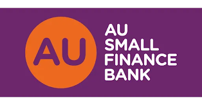
AU SMALL FINANCE BANK LIMITED Mr. Sanjay Agarwal established AU Finaciers in 1996. After bagging the Small Finance Bank (SFB) licence in 2015, Au Financiers commenced its journey as an Small Finance Bank (SFB) on April 19, 2017 it became a Scheduled Bank status on 1st November. In 2021, the bank became the Largest Small Finance Bank of the country and evolved its positioning from ‘Chalo Aage Badhein’ to ‘Badlaav Humse Hai’. Reminiscent of the rising sun, AU Small Finance Bank heralds a new dawn into the lives of everyone it touches. This sentiment is perfectly captured in its logo. The colours are young and vivid, so as to break away from the clutter and demand attention. The colour orange is a warm and inviting colour, very stimulating and signifies optimism. The colour purple evokes creativity and innovation as well as connotes being premium. To balance the attributes of the above two colours, we have used white which signifies simplicity, transparency and symbolises n...

BROOKE BOND RED LABEL

Image
BROOKE BOND RED LABEL Brooke Bond Red Label is one of India’s largest selling tea brands. Its logo has a red background on which its name ‘Red Label’ is written in white using stylish brush strokes. Cresting this is the logo of the parent brand ‘Brooke Bond’.

BROKE BOND 3 ROSES

Image
BROOKE BOND 3 ROSES Brooke Bond 3 Roses tea claims to have the perfect taste, colour, flavour and irresistible aroma. It is tested by professional tea tasters. It is graded and perfectly blended in it’s unique Tea Excellence Centre giving it the perfect taste, colour, flavour and irresistible aroma. Its logo has a background of tones of yellow and red forming a scene of sunrise or sunset and has the name ‘3 Roses’ written in white with red border using an italics font. This is supported by a bunch of three yellow roses. Cresting this is the logo of the parent brand ‘Brooke Bond’.

PRESTIGE ESTATES PROJECTS LTD.

Image
PRESTIGE ESTATES PROJECTS LTD. Prestige Estates Projects Ltd. was founded in 1986 by the team, which has been inspired by CMD Irfan Razack and marshalled by his brothers Rezwan Razack and Noaman Razack. The company has diversified over time into a number of services. Its gold and black logo has a motif of a landing eagle in the backdrop of a sun or circle, supported by its name. At the bottom within a pair of lines, its tagline ‘Add Prestige to Your Life’ is written. Eagle represents strength, leadership, being meticulous and a focused achiever its goals. Gold is the colour of the achiever and black represents perpetuity.

UDHAIYAM ORGANIC & SPECIALITY FOODS

Image
UDHAIYAM ORGANIC & SPECIALITY FOODS Udhaiyam Organic & Spciality Foods desires to bring a new rise in daily food habits and a hope in lifestyle. Udhaiyam means to rise and strive to be diligent and rising of sun. Food directly impacts our body and hormones. Udhaiyam is committed to deliver excellent quality organic food which is good for health and feast for taste buds too. Its logo in the tones of yellow, green and brown has a bullock cart carrying spices, dal, rice, honey and vegetables on a green earth with rising sun in the backdrop supported by a brown circular border. On the left side of this is the sheafs of cereal complete the circle and beyond. Below this motif, its name is written in orange and green. At the bottom its tagline ‘Arise Towards a Healthy Life’ is written.

INDIAN ASSOCIATION FOR THE CULTIVATION OF SCIENCE

Image
INDIAN ASSOCIATION FOR THE CULTIVATION OF SCIENCE Founded on July 29, 1876 by Dr Mahendra Lal Sircar, Indian Association for the Cultivation of Science (IACS) is the oldest institute in India devoted to the pursuit of fundamental research in the frontier areas of basic sciences. Professor C V Raman worked at IACS during 1907 to 1933, and it is here that he discovered the celebrated effect that bears his name and for which he was awarded the Nobel Prize in Physics in 1930. Activities of the Association at 210 Bowbazar Street, Calcutta, in the very early years were supported by generous public contributions. In the early phase, the list of lecturers in Science in IACS included all the luminaries of the era: Father Lafont, Jagadish Chandra Bose, Asutosh Mukherjee, Chunilal Bose and Pramathanath Bose. Pandit Iswar Chandra Vidyasagar and Kesab Chandra Sen were among the members of the first Trustee Board of IACS, with Dr. Sircar himself as the first Honorary Secretary. Apart fr...

MANGALORE ELECTRICITY SUPPLY COMPANY LIMITED

Image
MANGALORE ELECTRICITY SUPPLY COMPANY LIMITED In the year 1999, the state government initiated the reforms process of the power sector. As a first step in 1999, the Karnataka Electricity Board was bifurcated into two companies. Karnataka Power Transmission Corporation Limited (KPTCL) and Vishweswaraiah Vidyut Nigama Limited (VVNL). The Karnataka Electricity Regulatory Commission (KERC) was also setup in 1999. In the subsequent stage of reforms, the transmission and distribution activities carried out by KPTCL were unbundled and four power distribution companies were formed in June, 2002. Mangalore Electricity Supply Company Limited (MESCOM) is one of the companies thus formed, with its headquarters at Mangalore. Another company i,e. CESC was carved out of MESCOM from June, 2005 to manage distribution functions. MESCOM is vested with the responsibility of distribution of power to the districts of Dakshina Kannada, Udupi, Shivamogga and Chikkamagalur. The company’s logo in blue...

NIMS UNIVERSITY RAJASTHAN

Image
NIMS UNIVERSITY RAJASTHAN Nims University Rajasthan, Jaipur is a largest self-financed university in Rajasthan, which is structured as a composite model university. This was established under the Nims University Act, 2008, enacted by the Government of Rajasthan and recognized by the Government of India Under the provisions of Sections 2(f) of the University Grants Commissions Act, 1956. The emblem of this university has a shield divided into three segments of red, green and blue with a yellow border. The red segment has caduceus staff that was carried by the olympian God Hermes. In Greek mythology, Hermes was a messenger between the gods and humans (which explains the wings) and a guide to the underworld (which explains the staff). Hermes was also the patron of travelers, which makes his connection to medicine appropriate because doctors of the olden days had to travel great distances by foot in order to visit their patients. The green segment has a torch which symbolises...

RITES LIMITED

Image
RITES LIMITED RITES Limited, a Miniratna (Category-I) and Schedule 'A' Central Public Sector Enterprise under the Ministry of Railways, incorporated on April 26, 1974, is a multidisciplinary engineering and consultancy organisation, providing a comprehensive range of services from concept to commissioning in all facets of transport infrastructure and related technologies. RITES is a leading player in the transport consultancy and engineering sector in India and uniquely placed in terms of diversification of services and geographical reach in various sectors such as railways, highways, urban engineering (metros) and sustainability, airports, ports, ropeways, institutional buildings, inland waterways and renewable energy. RITES became a listed company in July 2018 and it has made it to the Top-500 listed Indian companies based on its market capitalization. Its blue logo has a motif and a wordmark of its name in sans serif italics. The motif and the font used looks s...

NATIONAL INSTITUTE OF AGRICULTURAL EXTENSION MANAGEMENT

Image
NATIONAL INSTITUTE OF AGRICULTURAL EXTENSION MANAGEMENT MANAGE was established in 1987, as the National Centre for Management of Agricultural Extension at Hyderabad, by the Ministry of Agriculture and Farmers Welfare, Government of India as an autonomous Institute, from which its acronym ‘MANAGE’ is derived. In recognition of its importance and expansion of activities all over the country, its status was elevated to that of a National Institute in 1992 and rechristened to its present name of National Institute of Agricultural Extension Management. Its green logo has a sheaf of cereal plants supported by its acronym in sans serif bold italics outlined font in English and at the bottom in Devanagari.

RAJESH EXPORTS LTD

Image
RAJESH EXPORTS LTD Rajesh Exports Limited (REL) was incorporated in 1989. REL is headquartered in Bangalore, India with operations spread across the world. This is the only company in the world with presence across the entire value chain of gold from refining to retailing. As a largest processor of gold in the world, REL processes thirty five percent of gold produced in the world and the largest exporter of gold products from India. It claims to be the lowest cost gold jewellery producer in the world. REL has one of the world's largest active jewellery design database of 29000 designs. The securities of REL are listed and traded in India on the NSE and BSE. Its logo in golden yellow has three squares ‘cut’ like a jewel placed inside the three quarters of a square and the fourth quarter has a ring studded with glowing diamond. The motifs symbolise the presence of the company in all the areas of the gold value chain.

APPASWAMY REAL ESTATES LTD.

Image
APPASWAMY REAL ESTATES LTD. Founded in 1959 by a visionary entrepreneur, Mr S Appaswamy, Appaswamy Real Estates Ltd. is an eminent real estate conglomerate and one of the leading builders in Chennai. Its founder, Mr Appaswamy is widely credited to have introduced the ‘Apartment Culture’ in Chennai by being one of the first to offer elegantly designed residences. Additionally, they were the builders in Chennai to pioneer the concept of creating townships in key suburban locations through the urban development model – one that is now replicated by many others. Its logo in earthy brown colour has a motif and its name written beside it. The motif has a right open palm supporting a house, symbolising trust worthy builders of homes.

CENTRAL FOOD TECHNOLOGICAL RESEARCH INSTITUTE

Image
CENTRAL FOOD TECHNOLOGICAL RESEARCH INSTITUTE CSIR−Central Food Technological Research Institute (CFTRI), Mysore (A constituent laboratory of Council of Scientific and Industrial Research, New Delhi) came into existence during 1950 with the great vision of its founders and a network of inspiring as well as dedicated scientists who had a fascination to pursue in-depth research and development in the areas of food science and technology. Research focus of CSIR-CFTRI has been revolved around broadly into engineering sciences; technology development; translational research and food protection and safety. Food Technology being interdisciplinary in nature, the mandate or vision of the Institute is fulfilled through various R&D departments and support departments along with its resource centres at Hyderabad, Lucknow and Mumbai. Its logo is a monogram created with its acronym using blue lowercase condensed sans serif letters, supported by a blue swoosh and three green leaves. Bel...

KWALITY WALL'S

Image
KWALITY WALL'S Kwality Wall’s, has been making ice cream for almost 100 years. The number of Wall’s tricycles on the road increased from ten in 1922 to eight thousand and five hundred in 1939. Even today you might see a tricycle in the city during the summer, if you keep your eyes peeled. Wall’s ice creams are now sold in over fifty different countries around the world. And it goes by all sorts of different names in each one. Its red logo with white heart is in the shape of an ice cream bowl. The heart is ensconced by a border which is open at the bottom giving it a casual and friendly look and feel as of a melting heart. The colour red and heart are prominent, legible and visible.

MCCAIN FOODS (INDIA) LTD.

Image
MCCAIN FOODS (INDIA) LTD. McCain Foods (India) is a wholly-owned subsidiary of McCain Foods Limited in Canada. Since 1998, McCain has been engaged in agriculture R&D and in development of the frozen food market in India and subcontinent countries. McCain products are used by leading fast food chains, hotels, restaurants, catering companies and are popular for in-home consumption. McCain focuses has a delectable range of products like McCain French Fries, McCain Smiles and local delights such as McCain Aloo Tikki, and cheese appetisers like Potato Cheese Shotzand Mini Samosa. One in every three French fries around the world is a McCain fry. World class potato processing plant in Mehsana district of Gujarat. The rectangular logo with black background and yellow border is slightly tilted. This is to attract attraction. The yellow represents the fried foods the company produces. The visibility of yellow on black is the highest of all the colour combinations. Its name is wr...

VIBE FASHION APPAREL PVT. LTD.

Image
VIBE FASHION APPAREL PVT. LTD. Vibe Fashion Apparel Pvt. Ltd. has been present almost all across India since 1997. Its core business is ‘clothing’ – a brand with a strong character whose style, design expertise and passion are clearly seen in the product ranges. Its product range comprises a comprehensive collection for women including innovative denim, fashion tops, dresses and knitwear with emphasis on sophisticated textures and silhouettes. Its logo is a word mark, in which its name is written in lowercase serif letters with big letter spacing. Below this its tagline ‘Sense It’ is written with three strokes on both the sides symbolising 'vibes' of fashion.

HOUSE OF HIRANANDANI

Image
HOUSE OF HIRANANDANI House of Hiranandani is a pioneer in developing integrated communities that have become landmarks in India. It has transformed the real estate skyline of Mumbai, Bengaluru, Chennai and Hyderabad with its signature styled neighbourhoods that offer holistic living experience to residents. Its logo is a monogram created using ‘H’ placed within a circle and cropped using two strokes forming a shape of a building layout. This logo projects an image of formidable strength, reliability and confidence.

RECKITT BENCKISER (INDIA) LTD

Image
RECKITT BENCKISER (INDIA) LTD Mortein from Reckitt Benckiser (India) Ltd. dates back to the 1870s when J. Hagemann, a German immigrant to Australia, became fed up with our menagerie of insects. He used crushed chrysanthemum flowers to produce a pyrethrum extract and created an insecticidal powder. The name is a combination of the French word mort (dead) and the German ein (one). Dead one? Nice one! Mortein India was launched in 1993 and the range initially included coils, mats and aerosols. Electrical vapourisers were launched in 1999 and Rat Kill in 2000. Mortein’s Insta range aims at providing instant protection against mosquitoes who cause diseases like Malaria and Dengue. Its logo has Mortein written in white sans serif bold caps and lowercase with black border and placed above a strong red stroke of power, shaped like a lightning.

INSTITUTE OF BANKING PERSONNEL SELECTION

Image
INSTITUTE OF BANKING PERSONNEL SELECTION Institute of Banking Personnel Selection (IBPS) is a recruitment agency for banks and allied institutions, which registered under Societies Registration Act 1860. The banks asked the National Institute of Bank Management (NIBM) to design a selection testing process through which they could hire proficient candidates. And as a result, a small unit named Personnel Selection Services (PSS) was established to handle these types of projects. A few years later, in 1984, PSS was converted into IBPS. IBPS currently functions as an autonomous body that is mainly engaged in conducting competitive exams for recruitment to clerical and officers posts in the banking sector. Now IBPS conducts four different recruitment processes namely CRP PO/MT, CRP RRBs, CRP Clerical, CRP Specialist Officers under which various exams take place every year for banking sector recruitment. Its vertically oriented logo in cyan has a motif created with ‘i’ and ‘B’ w...

THDC INDIA LIMITED

Image
THDC INDIA LIMITED THDC India Limited (formerly Tehri Hydro Development Corporation Limited), is under the ownership of National Thermal Power Corporation Limited, Ministry of Power, Government of India. It was incorporated in July 1988 to develop, operate and maintain the Tehri Hydro Power Complex and other Hydro Projects. THDCIL has also ventured into thermal power generation. Its logo in light and dark blue has a water turbine fan with three blades. Its name is written in Devanagari and English.

ACKO GENERAL INSURANCE LIMITED

Image
ACKO GENERAL INSURANCE LIMITED Acko General Insuarnce Limited is a general insurance company. It started in 2016 as India’s first digital insurer and are currently the fastest growing insurance company in the country. Acko General Insurance Ltd. is India’s first and fastest growing InsurTech company which makes buying and using insurance effortless. It was founded in 2016 by Mr. Varun Dua. The company is backed by Amazon, Accel, Catamaran Ventures, Elevation Capital, Swiss Re Transamerica Ventures and seasoned investors like Ashish Dhawan, Kris Gopalakrishnan, Hemendra Kothari, Atul Nishar, Rajeev Gupta, Venk Krishnan and Subba Rao. Its latest round of funding has also added Binny Bansal, RPS ventures and Intact ventures to its list of investors. The stadium (round cornered rectangle) logo uses Montserrat and Lato fonts in lowercase with uppercase ‘K’ in purple background with the counter of ‘o’ filled with emerald green. The chosen typefaces give a feeling of casual and bei...

NATIONAL SINGLE WINDOW SYSTEM

Image
NATIONAL SINGLE WINDOW SYSTEM The National Single Window System (NSWS) is a digital platform to guide you in identifying and applying for approvals according to your business requirements. The Know Your Approvals (KYA) module includes guidance for thirty two Central Departments and thirty two States. The portal hosts applications for approvals from twenty eight Central Departments and twenty State Governments. These approvals can be applied through NSWS. Its logo has an emblem in inverted ‘s’ in black starting with an orange dot and ending with a green dot, symbolising the application and approvals of proposals through a single window. Alongside, its name is written in black sans serif condensed type.

HERO FINCORP LIMITED

Image
HERO FINCORP LIMITED Hero FinCorp was ncorporated in December 1991 as Hero Honda FinLease Limited; the restructuring of our parent company Hero MotoCorp Limited, led to its present form as Hero FinCorp Limited. It is present at close to two thousand retail financing touch-points across Hero MotoCorp's network, and have partnered with over two thousand satisfied corporate clients. Its geometric logo in green and red has ‘H’ and ‘F’ written as a solid structure in extra bold sans serif in green with the top horizontal stroke of ‘F’ as a red square providing this monogram an attractive accent. This symbolises friendly green being spearheaded by a red and dynamic head, the colour of its parent company’s logo. Below this ‘Hero FinCorp’ is written in red and green, with ‘Hero’ in red and the ending point also in red

JIO PAYMENTS BANK LTD.

Image
JIO PAYMENTS BANK LTD. Reliance Industries Limited was granted an in-principle approval by the Reserve Bank of India (RBI) to establish a new Payments Bank under the Banking Regulation Act, 1949. It then partnered with the State Bank of India to support this ambitious initiative of building payments bank capabilities for every Indian and accordingly, Jio Payments Bank Limited, was incorporated in November 2016. Its blue logo has a circular emblem and a word mark of its name. The emblem has a shield in a blue circle in which ‘₹’ symbol is placed. Alongside, its name is written in classic sans serif font.

NATIONAL BANK FOR FINANCING INFRASTRUCTURE AND DEVELOPMENT

Image
NATIONAL BANK FOR FINANCING INFRASTRUCTURE AND DEVELOPMENT The need for establishing a dedicated financial institution to address the long-term infrastructure financing requirements in India was realised considering the nation’s GDP growth objectives and the role of infrastructure development towards the same. In response to this need, the National Bank for Financing Infrastructure and Development Act, 2021 was introduced, as it denotes the return of Development Financial Institutions (DFIs) in the country after a few decades. The Act subsequently received the assent of the President on March 28, 2021 and has come into force effective April 19, 2021. Reserve Bank of India (RBI) vide its letter dated March 8, 2022 has advised that NaBFID shall be regulated and supervised by RBI as an All India Financial Institution (AIFI) under sections 45L and 45N of the RBI Act, 1934, respectively. Its logo is a wordmark of its acronym in blue with ‘a’ in lowercase.

STUDENTS’ FEDERATION OF INDIA

Image
STUDENTS’ FEDERATION OF INDIA Students' Federation of India claims to stand for the establishment of a progressive, democratic and egalitarian education system to ensure social justice and intellectual self-reliance since 1970. Its slogan is 'Independence, Democracy, Socialism'. Its symbol is “a red five cornered star in the top left corner, on a white background and Independence, Democracy and Socialism written one beneath the other also in red.

SWIMMING FEDERATION OF INDIA

Image
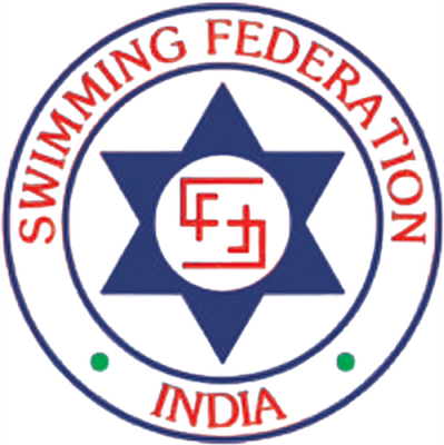
SWIMMING FEDERATION OF INDIA The Swimming Federation of India (SFI) is the national governing body for aquatic sports in India. Legally, it is a nonprofit association registered under the West Bengal Societies Registration Act, 1961. The federation holds elections for its office bearers every four years. The SFI oversees competitions in the sports of swimming, masters swimming, synchronised swimming, diving, high diving and water polo. It is affiliated to FINA and the Asian Swimming Federation (ASF). Its circular emblem in blue, red and green has a six-pointed star with ‘S’ and ‘F’ forming an interesting shape of a swimming pool and its markings, ensconced by borders with blue lines on which ‘Swimming Federation’ and ‘India’ separated by a pair of green dots are written.

INTERNATIONAL DAY OF YOGA

Image
INTERNATIONAL DAY OF YOGA Yoga is an ancient physical, mental and spiritual practice that originated in India. The word ‘yoga’ derives from Sanskrit and means to join or to unite, symbolising the union of body and consciousness. Recognising its universal appeal, on December 11, 2014, the United Nations proclaimed June 21 as the International Day of Yoga by resolution 69/131. The draft resolution establishing the International Day of Yoga was proposed by India and endorsed by a record 175 member states. Folding of both hands in the logo symbolises yoga, the union, which reflects the union of individual consciousness with that of universal consciousness, a perfect harmony between mind and body, man and nature, a holistic approach to health and wellbeing. The brown leaves symbolise the earth element, the green leaves symbolise nature, blue symbolises the water element, brightness symbolises the fire element and the sun symbolises the source of energy and inspiration. The log...